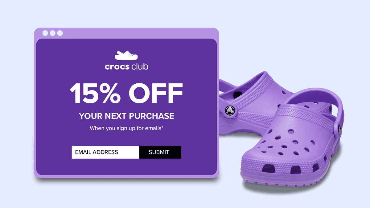
Crocs' opt-in form is a perfect example of how simplicity and attention to detail can lead to high sign-up rates. By focusing on user-friendliness and an accessible design, just like their clogs, Crocs easily binds subscribers to their brand. And just as the icon of ugly fashion has had a groundbreaking impact on the fashion world, Crocs is also a textbook example of how to successfully do list building.
Where does Crocs' popularity come from?
Between 2020 and 2021, Crocs saw a 430% increase in sales. This was partly due to the pandemic and the need for comfort during all the time spent at home. But beyond that, Crocs has also become a fashion icon, driven by the “ugly fashion” trend, collaborations with celebrities and designers, and changing gender norms. These collaborations have led to innovative styles and a wide audience that embraces the shoes, from influencers to Gen Z on TikTok.Their continuous evolution and creative collaborations ensure that Crocs are much more than a temporary trend—they are here to stay. Naturally, this also includes a well-thought-out marketing strategy.
A stream of fresh contacts
To succeed in email marketing, you need to convert visitors into email contacts. This way, you can keep them informed about new limited edition releases, collections, promotions, and other updates. And to achieve this, Crocs employs all the best practices.Turn heads with your opt-in form
To score new contacts, visitors first need to find your form. You can do this by prominently referencing your opt-in form in logical places throughout your website. Crocs does this prominently in three ways:Reference in the header
Above the menu bar, there is a banner space designated for highlighting promotions. But right next to the account button, you also find an immediate link to the opt-in form. They also prominently display the welcome discount!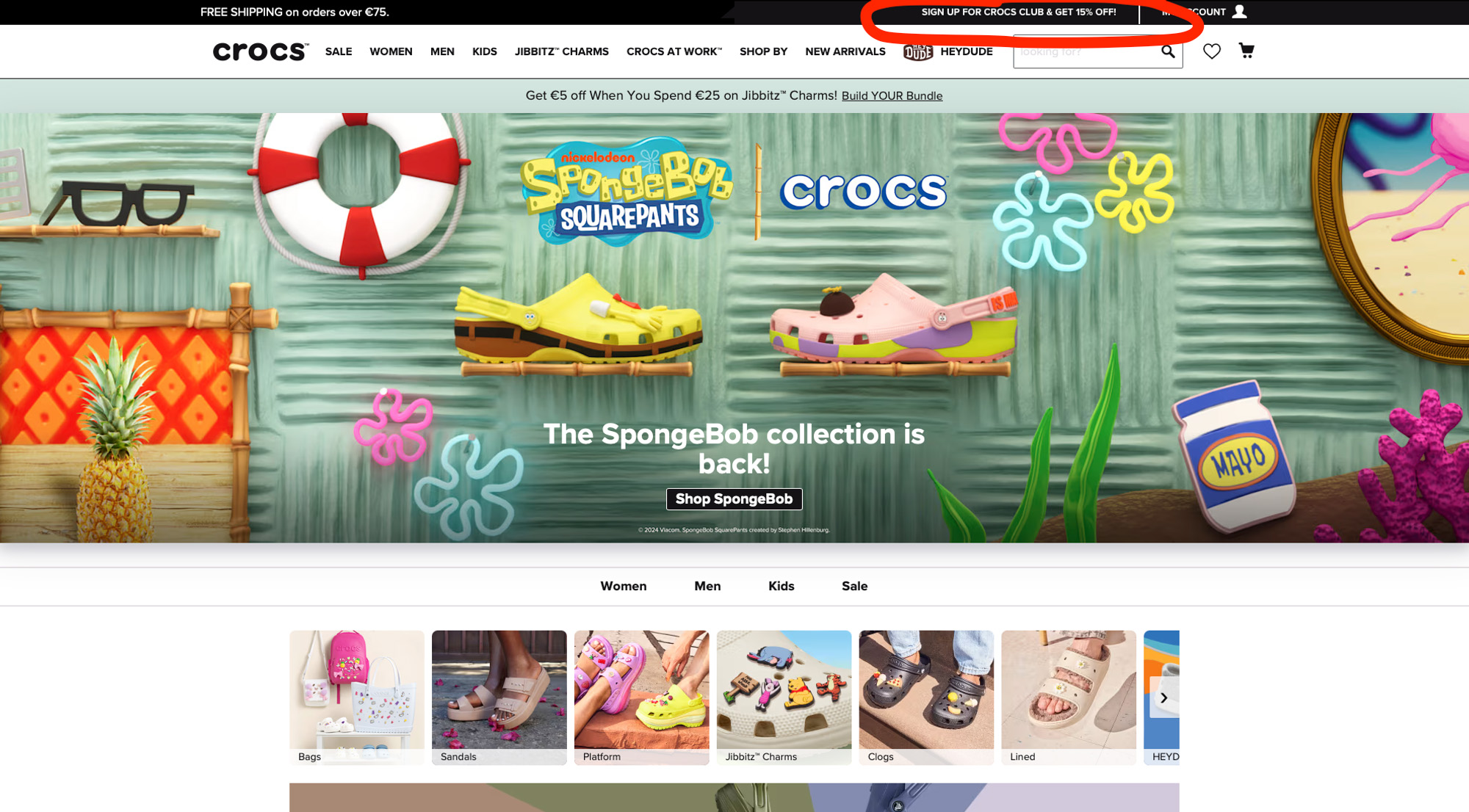
Reference in the footer
They repeat this in the footer, with a bold call to action. The advantage of having an opt-in form in both your header and footer is that they appear on every page of your website. Visitors typically look for important information in these areas. Use this real estate wisely!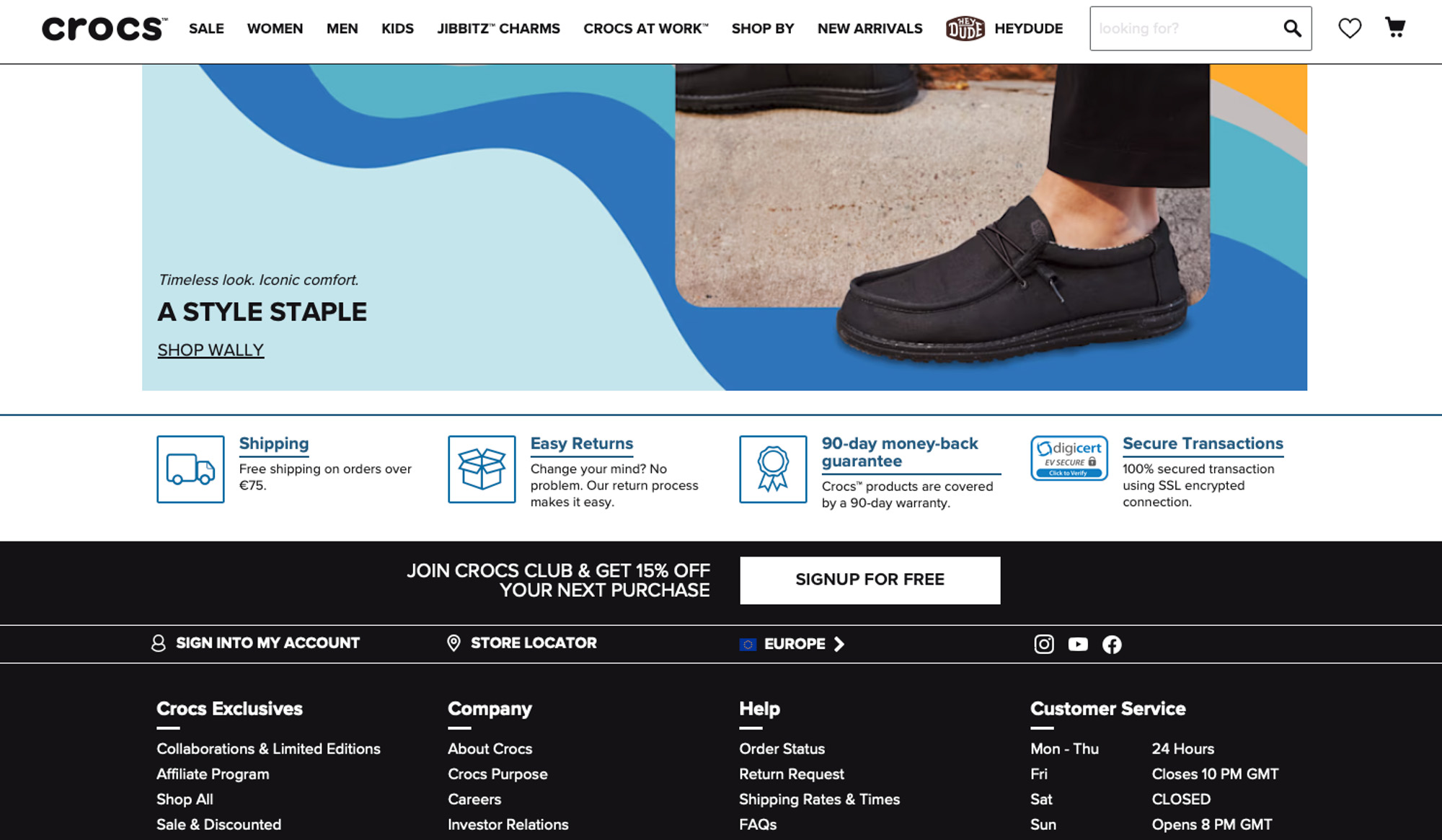
Banner on the homepage
When scrolling through the homepage, visitors will also find a banner about the Crocs Club. Again, the discount is prominently displayed. Notice the language used here: exclusivity is emphasised by referring to a club, both in the title and in the call to action.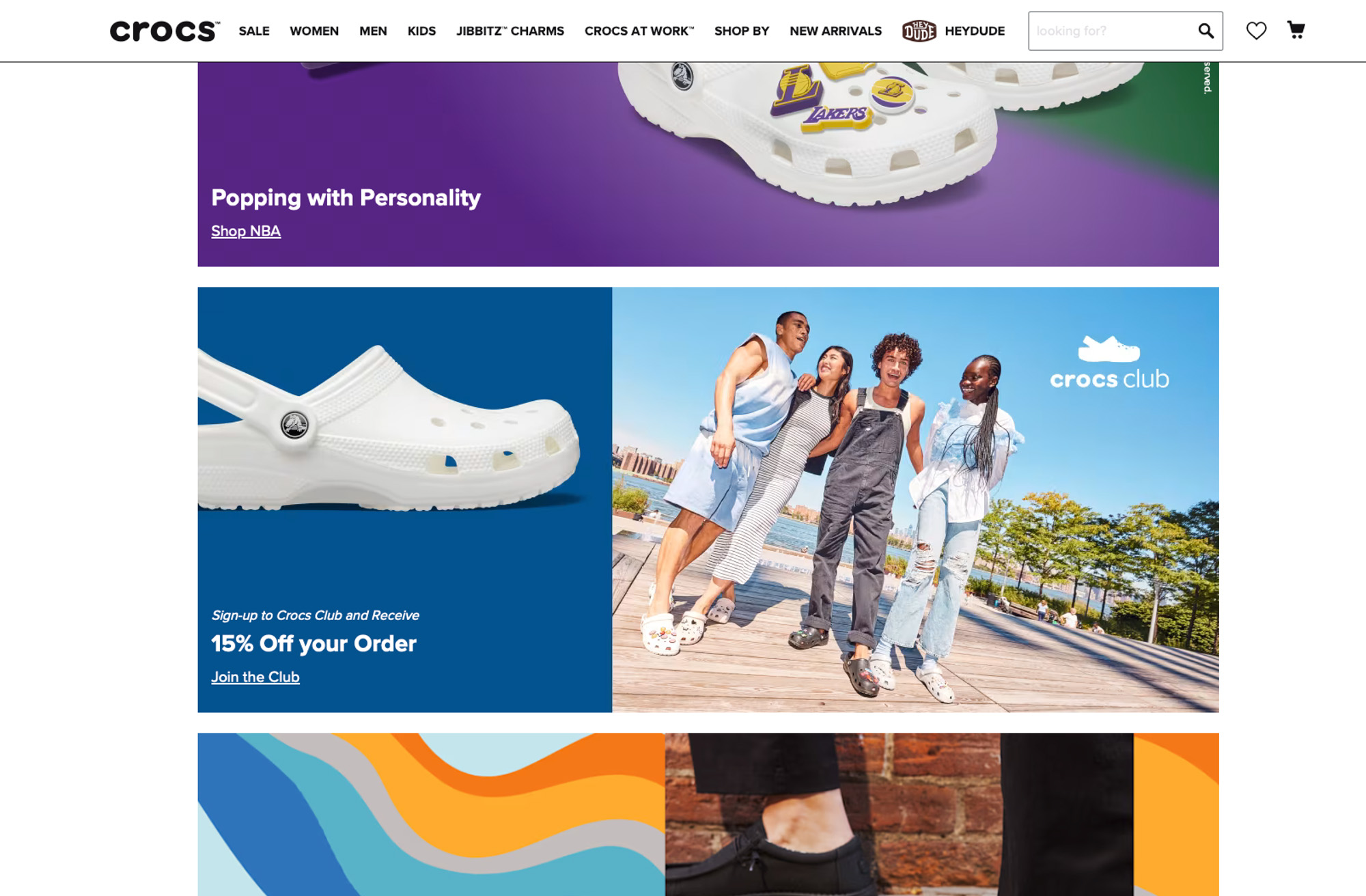
Pull out all the stops to boost conversions
The Crocs opt-in form is just like their shoes: simple, effective, and an absolute must-have for comfort in your marketing strategy.At the top of the page, you'll find the form. Crocs keeps it as accessible as possible by only asking for an email address. The discount is prominently displayed in bold letters, and the fine print is strategically placed near the call to action.
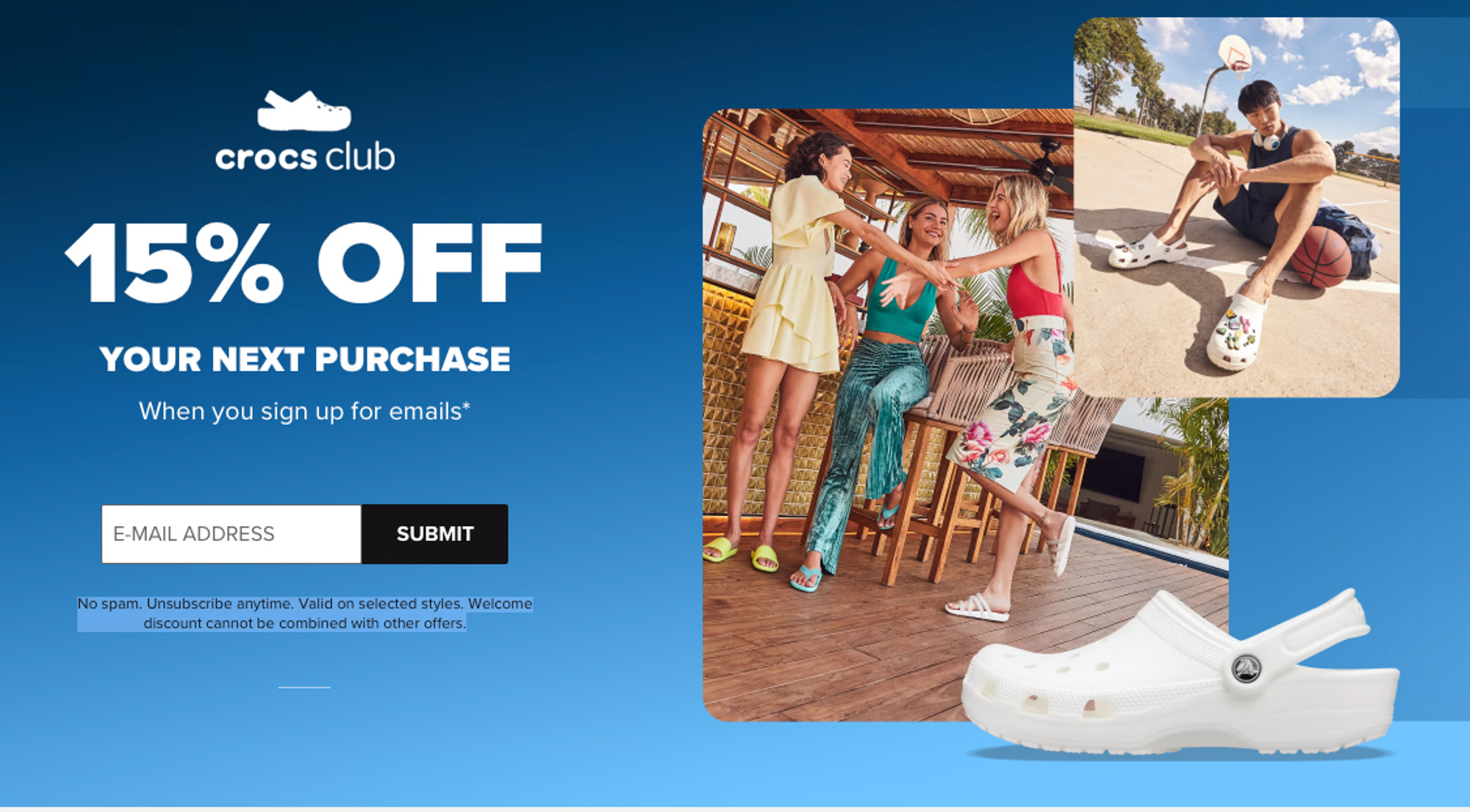
Still unsure? Scroll further down. Besides the welcome discount, there are more reasons to join the club. Members receive rewards and discounts, products are personalised based on your preferences (likely through click behavior), and you are always the first to know about news and deals.
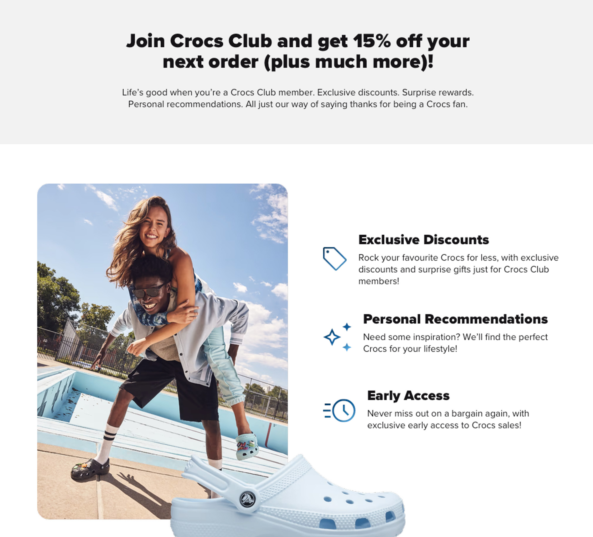
The bottom of the page features Charms and new arrivals. This is smart too: if you see something you like, you'll probably want to subscribe to stay updated on new arrivals.
A strong email strategy starts with your opt-in form
The success of your email strategy is closely tied to how well you convert interested readers into mailing list subscribers. This means:- Ensuring the right people join your list. Who would find my content and products interesting?
- Making it clear to website visitors that they can sign up.
- Clearly communicating the benefits of joining your mailing list.
Check out our tips on how to optimise your website for newsletter sign-ups.
 Michelle Dassen