You want to expand your customer base and bring in more conversions. Potential customers have to cross an initial threshold, however, before they decide to make their first purchase with you. Promotions are the ideal means to win any doubters over.
Did you know that 76% of consumers have already made a purchase because of a promotion email and that 86% of customers would like to receive promotion emails on a monthly basis? All the more reason to find out how you can use promotion campaigns for your brand yourself.
Did you know that 76% of consumers have already made a purchase because of a promotion email and that 86% of customers would like to receive promotion emails on a monthly basis? All the more reason to find out how you can use promotion campaigns for your brand yourself.
When to send promotion campaigns?
If you want to send effective promotion emails, you will have to grab and hold your contacts' attention and try to convince your contacts that your promotion is valuable enough for them to take action. This is quite a lot in so short an email, especially if you are not a trained copywriter, but it can be done. We will help you.When setting up your strategy, you ideally start from the customer journey. If you know your customer's journey even before the customer buys, you can tailor your communication to it much better. This is how you know who your customers are, what they expect, why they are in doubt, and what is needed for them to make a purchase.
When you know your contacts, you can assist them better in going through the steps from the marketing funnel to make the actual purchase.
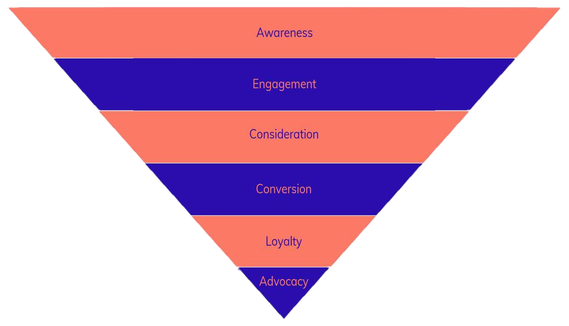
Awareness
A prospect gets to know you or gets in touch with you again. Your purpose? Getting noticed and encouraging the prospect to find out more about you.Engagement
Try to make them take a first action, like downloading a white paper or clicking through to an article.Consideration
Your prospects consider their options and compare you with your competitors. Tell them why you are the better choice.Conversion
At this point, your prospects respond to your promotion and make a first purchase. Make sure that the steps to follow are clear, to prevent the prospects from opting out.Loyalty
You have earned their trust. Here is a chance to make your new customers buy more.Advocacy
When your contacts are fully convinced and have gone through the cycle several times, they will also recommend you to other people.Ideally, your promotions are within the consideration phase. So maybe they are the last push your potential customers need.
Types of promotion emails
Start with your object: do you want to make the potential customers buy? Does your target group have to go through an onboarding process? What type of promotion could be helpful?Use your contact calendar too, in which you collect all important moments and means of inspiration you want to use.
Some examples are provided below that help you get ideas and get started. With each example we add insights and tips for your emails. Let's get started.
1. Holidays and special moments
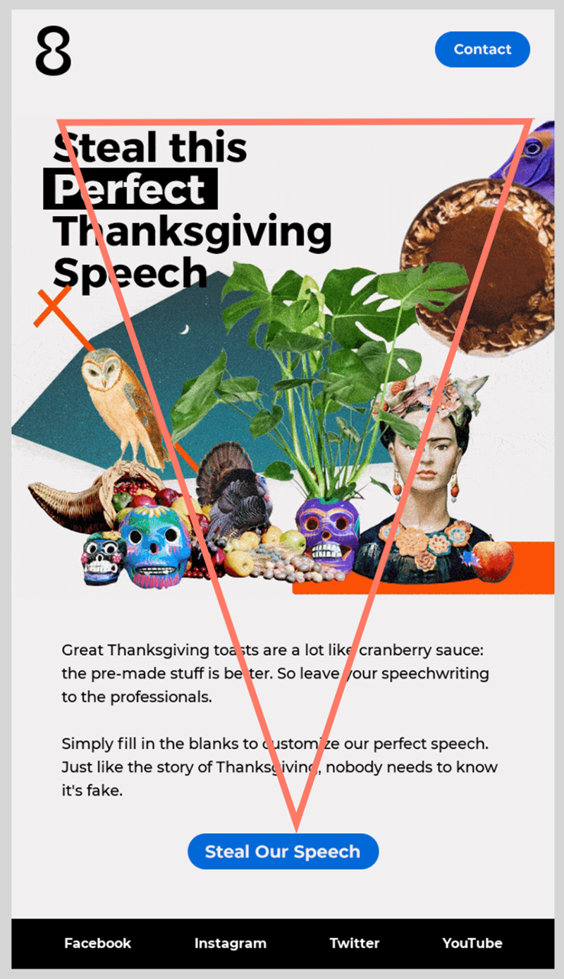
These are possibly the first promotion emails you think of. This example is about Thanksgiving. Via this app, you can have your Thanksgiving speech made. Let's go into some further detail about the various parts of this email.Subject: The subject immediately reveals the output: your Thanksgiving speech. The subject is not too long; the full subject is entirely visible on alle devices. The emoji causes the email to stand out in the inbox. Using emojis occasionally has no or hardly any adverse impact on the spam filters and can make specific emails stand out.
Content and layout: The message is concise, and it is based on the inverted pyramid, so that the contact's eye is automatically drawn to the call to action:
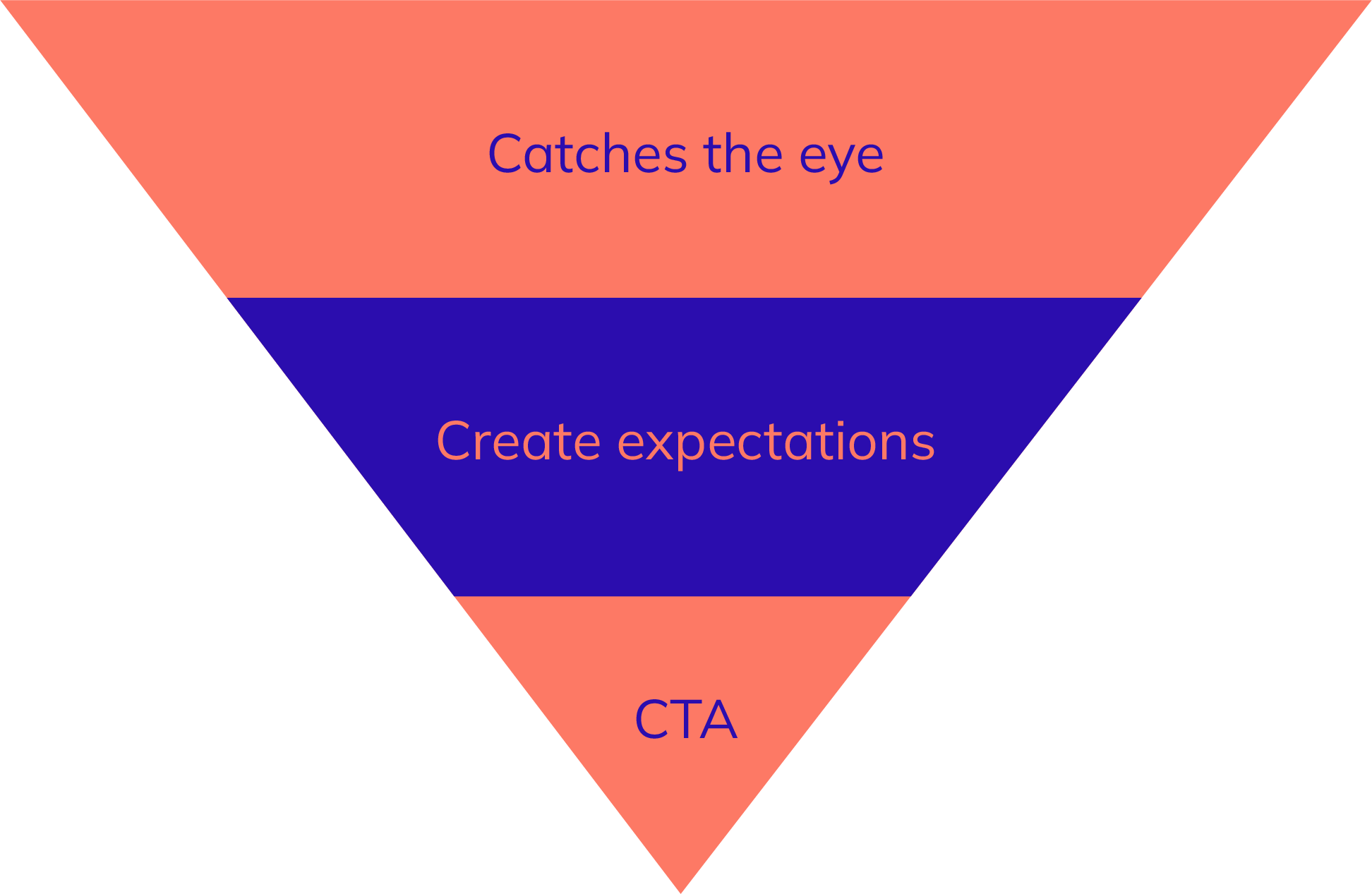
The content is brief and nice to read. Note that references like ‘we' or ‘us' are not used anywhere in the email.
Call to action: The button is clearly visible and catches the eye with its blue colour against a white background. The text is not too long but very clear. You know exactly what will happen if you click it. More tips about effective calls to action are provided here.
2. Exclusive deals
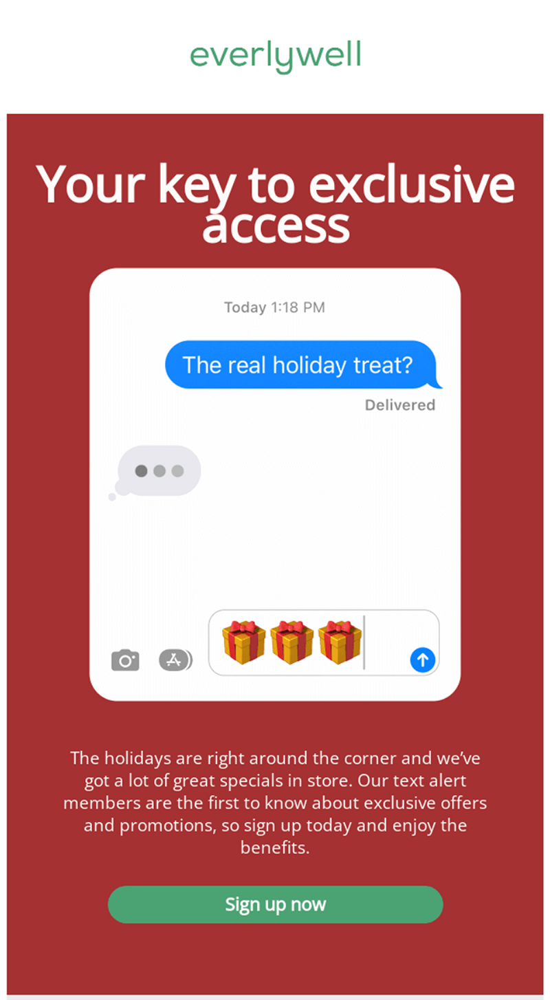
You can send exclusive deals to a select group of contacts. You could give your newsletter subscribers earlier access to exclusive deals (more choice for them and an extra reason to subscribe to your newsletter).Everlywell has even turned it into a product:
Subject: Exclusivity always works well. People are afraid they miss out on something. Emojis, figures or percentages could have enhanced the visibility of this subject in the inbox. Do you doubt if it could also work for you? If so, set up a simple AB test.
Message: The text is concise and it serves one purpose. The readers know exactly what is expected of them.
They only use two colours: red and green. Additionally, the green of the button is the same green as the green of their logo.
Image: At the top of the message they start with their logo. This creates recognisability and trust.
There is a good balance between image and text. As a result, the message will also be clear when the images are not downloaded. You may wonder whether the title is clear enough, though, because the image pushes the rest of the copy down.
Call to action: The button text is clear. You know what is expected of you when you click it: subscribe. A ‘Read more' button would not lead to readers taking action, and it does not reveal what follows.
3. Giveaways
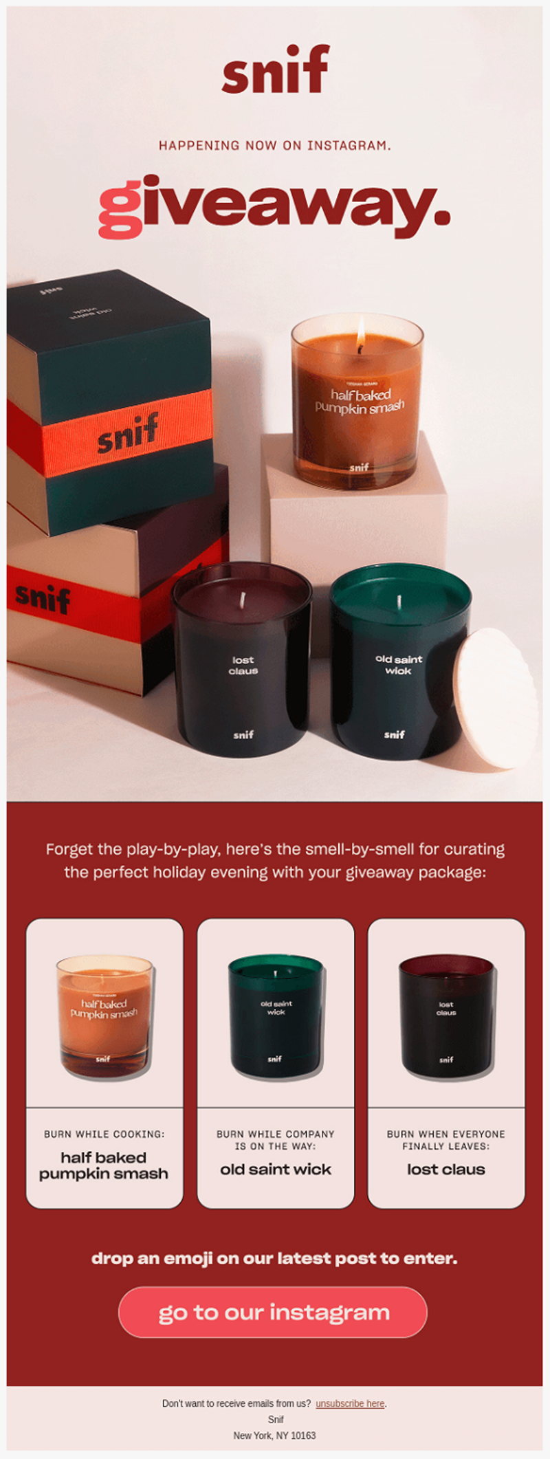
Everybody wants to get something for free. Ideal to make promotion emails for. On social media, you come across one giveaway after another. Therefore, the two can be combined perfectly. Send an email to your contacts to make them visit your social media channel to participate in the giveaway. You reach more contacts via both channels, and you show them the way to your other channels. A win-win situation.In the example below, you can see how to do this.
Subject: The subject is fairly short. This is not a problem, but make sure your message stands out from the rest.
Also use the preheader to emphasise your subject and provide more information.
Content and layout: They use only a few colours in the message. This makes the message clearer and more attractive.
The text they use is fairly limited, but the message is clarified by the title. The title, however, has been added as an image to the message, like the call to action, so that it is not really a button anymore. The entire message is therefore one single image. If you open your message without the images, only the unsubscribe link will be shown.
To give readers a chance to win something with this giveaway, an emoji has to be placed underneath their latest post. This message is not clear, however, as it is placed in small type just above the button.
Images: When you receive the email in this way, it looks magnificent. In practice, however, images are not always downloaded automatically. This would mean that little of this message would be left, making the message less clear.
Make sure there is a good balance between text and image, so that your message is also clear without the images.
Call to action: The button clearly indicates what you can expect if you click it. You go to their Instagram account, where you can participate in the competition. However, the button could stand out a bit more. The colours of the button and the background are more or less similar, which makes the button less visible and consequently less inviting to be clicked.
4. Limited time offers
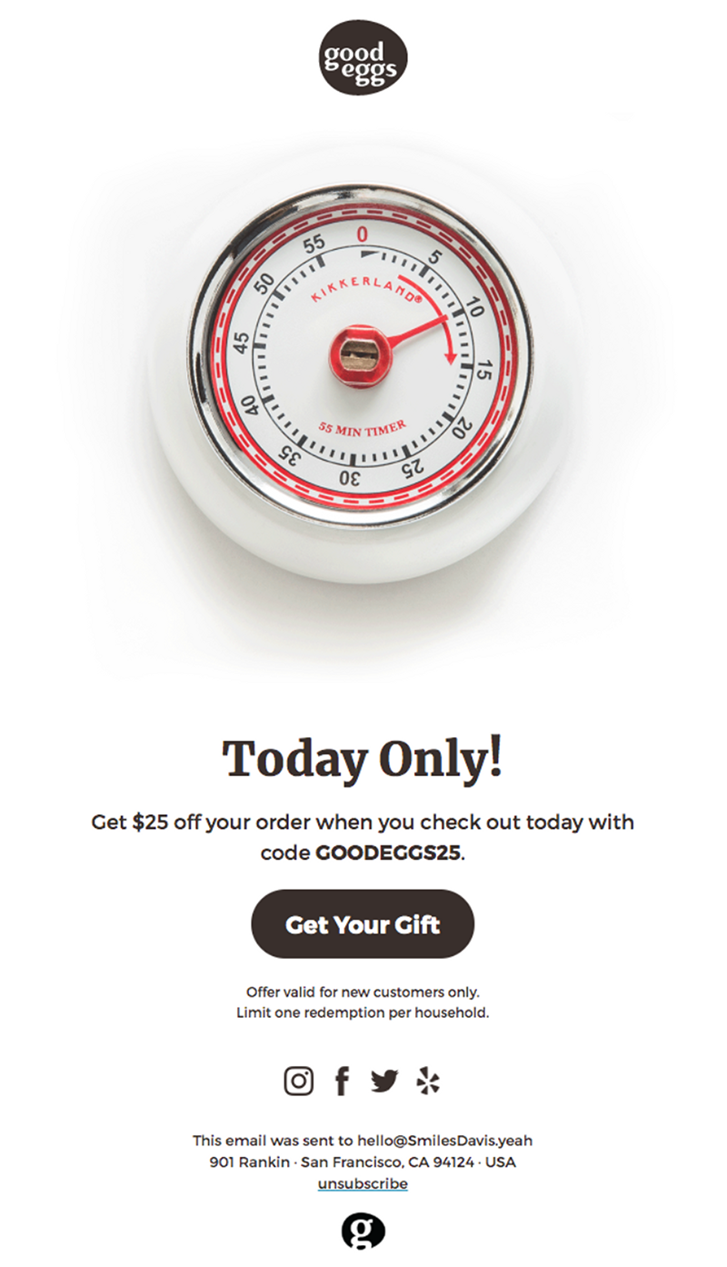
Offers are mostly limited in time. If you want to offer something for a short period of time, it is specifically important that it gets noticed. It starts with the subject. Make sure you catch the reader's eye and use the preheader to make your subject stand out. Additionally, a clear message and eye-catching image should ensure that your contact actually responds to the offer.Subject: In this example, too, the subject is fairly short. It does indicate it is about something temporary, but not exactly what. It is not really clear it is about an offer. So is the FOMO (fear of missing out) really exploited to its full potential?
Be as clear as possible: indicate that the action is only temporary, when it ends, which information you provide in the offer, and how much discount is given. In that case, the readers do not even have to open your email and can surf to your website.
Content: This message is concise but includes all the necessary elements: a discount is offered. It also makes clear that the action is temporary and that the readers should react quickly if they want to benefit.
If an end date is added, the reader gets a sense of FOMO and will respond even more quickly to the offer in order not to miss it.
Image: In this case, the image is well chosen. Good Eggs is a company via which you can shop online for local products. The image is a timer to indicate the offer is temporary and that the offer is only provided today. The cooking timer also fits in with their product.
Call to action: They have used a clear call to action. The text clearly describes what will happen. The button colour should be more striking to stand out a bit more.
5. Product launches
The product launch is another type of promotion. If you launch a new product or if you have any novelties you want to show, these emails are an interesting option to use in your communication. Here we have an example from Den. They send an email to indicate they present two new designs.Let's take a closer look.
Subject: In this subject, the word ‘NEW' is in capitals, and the sentence ends with ‘?!'. These elements make the email stand out among other emails in the mailbox.
The subject also clearly reveals what the message is about.
Layout: The message includes various colour blocks, which improves readability. In this way, people who do not read everything can still find all the information they need.
The message has a logical structure too. At the top, it starts with a button that shows what it will look like. The second block is about the new structure plans, and in the last part the possibility is provided to click through.
Call to action: The buttons have a colour that differs from the background colour; a shaded edge gives more depth, making it clear it is a button. The button text clearly indicates what will follow if you click the button. Always use active language in the button text. A ‘Read more' button does not reveal what will happen and does not incite the reader to take action.
6. Free content
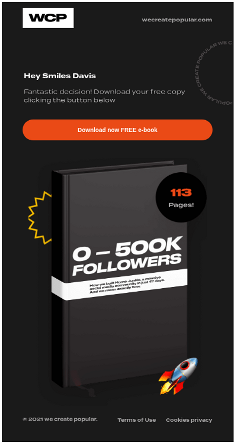
Offering free content is an ideal way to draw your contacts' attention and make them visit your website. You can do this with a welcome email but also with an email to thank your contacts for their trust.Subject: The subject in this example has been kept fairly simple, but it does tell you what you can expect. It is about a download, and it says so in the subject. It is a free download too, so do not forget to mention it.
Content: There is little text in this message, and that is quite all right. The message comes with a free download, which you can use for a new subscription to your newsletter for instance. In that case, the contact does not expect anything else but a download link.
Images: The image is the cover of the e-book that can be downloaded. It makes the message more attractive and adds to a better balance between text and image, which enhances deliverability.
When you place images, make sure they do not include any essential information: if the images are not downloaded automatically, your contact will not miss any relevant information. In this example, your contact will not even notice there should be an image, as it is placed all the way at the bottom.
Call to action: The call to action stands out with its orange colour against a black background. In this case, they have opted for placing the button at the top rather than at the bottom. As a result, the contact may choose not to read any further and stop at the button. All relevant information is at the top and visible without scrolling.
Another way of offering free content and making your contact act quickly is by limiting the number of items offered. In the example below, the reader has a chance of getting a free e book for children. The number of available books is limited to 500, which will encourage a contact to act swiftly.
Subject: In this subject, capitals are used to catch the attention.
The email: The message is fairly long, due to the images. If you receive this message on your mobile device, you will have to scroll quickly to get to the call to action.
The fact that Gmail, for instance, will not show the message completely should also be taken into account. With Gmail the message size is restricted to 102kb. If your message is bigger, a link at the bottom of the message will have to be clicked for a full display of the message.
You may opt for using the full information for your underlying landing page, if you have one. In the email, you want to encourage people to click. If you opt for a long email, repeat the call to action and do not place it only at the end.
Images: For the images, they use the book cover and a step-by-step plan describing how to take part in the action. This does not only draw the attention, but it also helps readers to win an e-book.
It is important, however, that alt texts are used, because these images clarify your text. A good alt text ensures the contact is encouraged to download the images.
7. Occasions made up
There are many possibilities to make promotion emails. You can also look for an occasion, or make one up, for sending a promotion email.Look at the examples below.
In this promotion, a mattress shop turns daylight saving time into a reason to offer a discount:
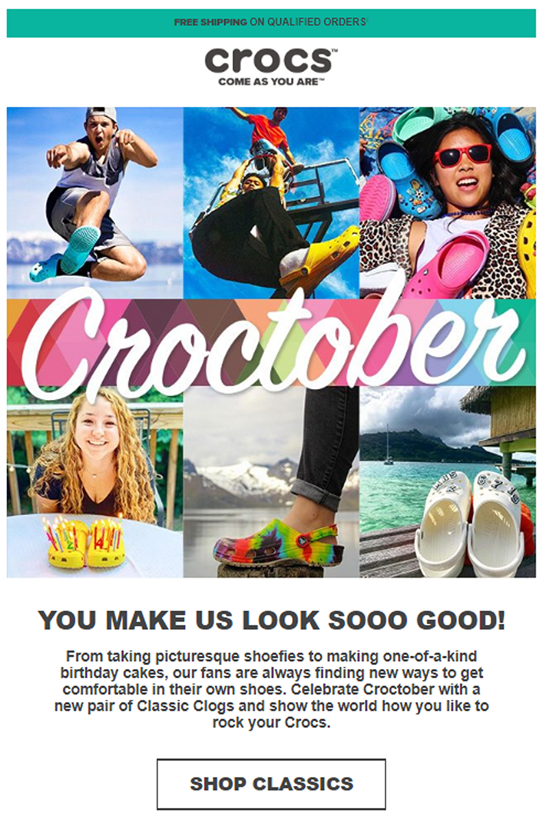
You can also make up a public holiday. The Crocs brand turns the month of October into Croctober. This is also shown in the subject: Happy Croctober.
As you can see, it does not always need to be a big promotion or a special holiday. You can also offer videos to your contacts to help them get to know your product better, send them a white paper with a subscription, or an announcement of new products. Give your creativity free reign and be original.
8. Black Friday and sale periods
The most obvious occasions to use discounts are Black Friday and sale periods, of course. Know that your competitors probably increase their frequency and that the inbox is a highly competitive environment at that moment.Do you send only one email, and your direct competitor a lot more? In that case, your brand is not going to stick, and you will lose many potential sale opportunities. Therefore, you need to look for a good balance.
How can you make sure your promotion stands out?
- Give your subscribers earlier and exclusive access to your best deals.
- Increase your frequency but find useful means of inspiration and reasons to communicate, such as higher percentages or when the deadline comes closer.
- Combine it with an effective subject line.
- Make sure your discount or offer is immediately clear, via copy and design.
- Let people know exactly how your promotion is applied: automatically or do they need a code? And if so, which?
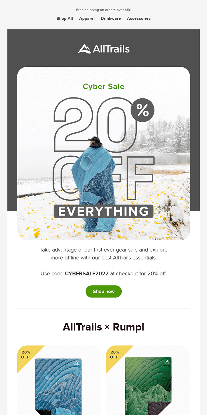
Layout: Alltrails opts for showing multiple products in the email. They keep their focus by clearly showing the specific promotion and the discount code.
Call to action: Once the readers have been informed about the promotion, they can click through in various ways. At the top is the navigation on the website, so that someone who is looking for something specific can see the right products immediately.
Are the readers not in doubt, or don't they know the assortment yet? Try to give them the push they need by including various products at the bottom of the email.
9. As a step of your automation or onboarding
A promotion for a specific day can be sent manually quite easily, or you can send it at the moment you want. Sending a promotion for an onboarding or a gift after a subscription or newsletter, for instance, is more complicated.This is where automation comes in. It saves you work, and your contacts will be happy with their gift.
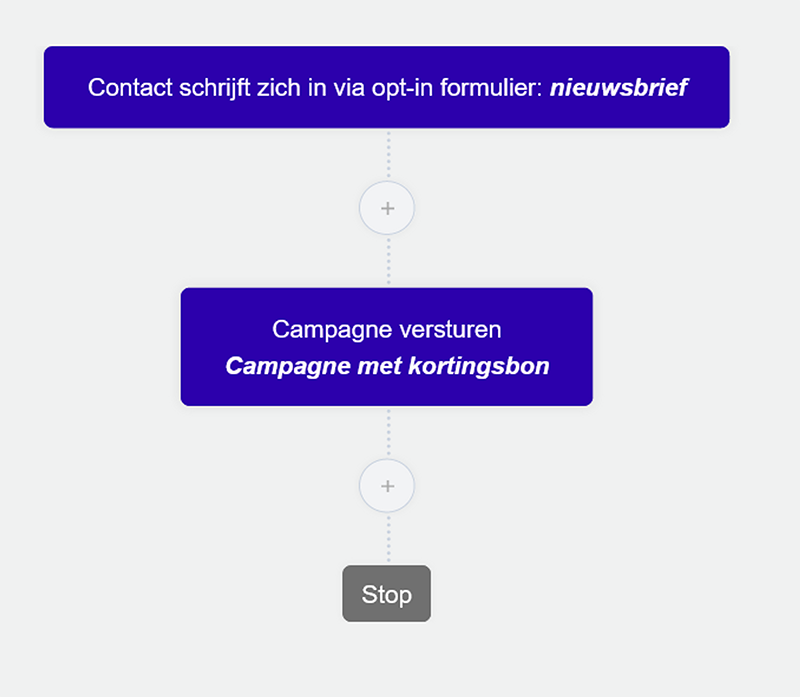
Automation for promotion emails is an easy process. All you need is a trigger and an action that follows.
If you want to send a campaign with a discount voucher after subscription to the newsletter, the trigger will be the subscription to the newsletter, and the campaign with the discount voucher will be the action that follows.
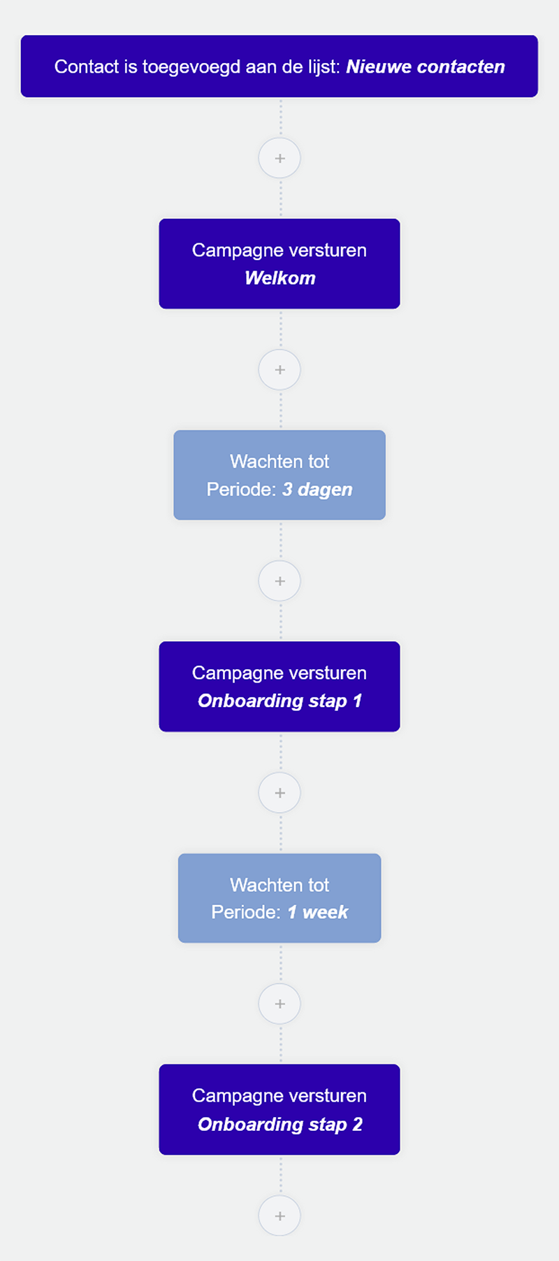
For an onboarding, the workflow can be extended. Here you can place the various onboarding emails and send them at fixed moments.
Getting started
How to start your promotion emails?- Decide what your promotion will look like: what is the object and what is your target group?
- Focus on your reader's ultimate benefit.
- Introduce the promotion immediately in your subject line.
- After you have drawn up your email, check if your promotion, deadline, product and call to action are clearly visible immediately.
- Make sure your branding is immediately recognisable.
- Be concise and choose images that strengthen your message.
- Think about the ideal frequency and how you can split your content.
