Dealing with email clients in a Flex sustainable manner
Let’s say you’ve been working away on your new email campaign these past few days. You’ve created an attractive email design on the basis of the available Flexmail features. In spite of a number of design elements you were unable to incorporate into your email campaign, you’re chuffed with the result. And you know why. (If not, read on!) You press the ‘Send’ button, schedule it for a later date or quickly perform an AB test. But, once sent, you notice that your email campaign wasn’t delivered correctly or even read for that matter. Talk about a waste of time and effort! At least, that’s how we see it.The above scenario is not uncommon, even among the best marketeers. So, when designing an email campaign it is essential to take account of the factors that affect the rendering and deliverability of your emails. One important factor is email client support. With contacts using various devices and various email clients, you need to keep the various guidelines per email client in mind.
Does the above situation ring a bell? Or are you determined to prevent a similar scenario in the future? Then this White Paper will prove to be a lifesaver. Flexmail does everything in its power to guarantee an optimum display in email clients, which is why we don’t offer you access to a number of design elements. Read this White Paper and learn how to deal with email clients in a Flex sustainable manner.
Is everything hunky-dory between your email design and your contacts’ email clients?
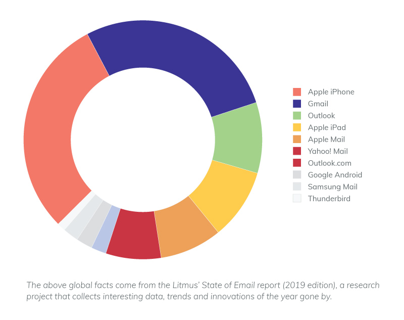
Stop! Before you start adding or removing design elements to/from your email design willy-nilly, make sure that you know exactly which email clients your contacts use most. Let’s face it, there’s nothing more time-consuming than designing emails in function of every conceivable email client. Save yourself the hassle and focus on your contacts’ most commonly used email clients. In doing so, you can be sure that your emails are displayed correctly at the majority of your contacts’.To find out which email clients the majority of your contacts use, we would recommend checking the reports on earlier emails you sent out via the Flexmail application. Click “Email clients” and the necessary email client information, user percentage included, will come up. Once you know the lay of the land, you can tailor your emails to those commonly used email clients and offer them a better user experience and boost engagement, like open rates, click-through rates and conversions.
A number of key facts
- Apple’s iOS Mail and Gmail are and remain the most popular email clients, with the largest email client market share.
- iPhone (29%), Gmail (27%) and iPad (9%) were the three most commonly used email clients in 2018.
- Outlook continues to gain in popularity: from an 8% market share in December 2018 to a 9% market share in January 2019.
- Mobile remains the most popular reading environment for emails. Some 43% of all emails sent out in December 2018 were opened on mobile devices.
- By the end of 2018, 39% of all emails were opened via webmail and 18% via desktop email clients.
- A remarkable fact: throughout 2018, webmail open rates rose by 3 percentage points.
The email clients used can vary from branch to branch and brand to brand. Establish which email clients and devices are popular among your audience.
Everything you need to know about the current most commonly used email clients
Life would be a whole lot easier if you knew which email clients display the design elements you used correctly, no? Read on to find out more about the possibilities and limitations of the current most commonly used email clients.Apple iOS Mail
The most popular email client, Apple iOS Mail, supports a relative large number of design elements on iPhone, iPad and Mac alike. It inter alia supports:- Emojis in the subject line
- Preheader text
- HTML5 videos
- Animated GIFs
- Formatted alt text
- Background images
- Web fonts
One design element Apple iOS Mail does not support is internal links that are incorporated into an email message. Furthermore, it is worth knowing that all email clients working with an iOS operating system simply do not support internal links. In other words, internal links are not correctly displayed on iPhones, iPads or Macs.
Gmail
Gmail is the second most popular email client and, like Apple iOS Mail, supports emojis in the subject line, preheader text, animated GIFs and formatted alt text. It also supports internal links but the extent to which will depend on the operating system used.So, if you want to include emojis in the subject line, think twice because, when you open an email on an iPhone, the standard Apple emojis will be displayed in the subject line, yet Goomojis in the message itself. (Goomojis? Gmail’s own emojis.) This makes for an uneasy mix of different styles: the standard emojis of the operating system in the subject line and the Gmail emojis in the actual message.
With regard to this email client, there are another few points you need to bear in mind. Gmail does not support HTML5 videos, background images or Web fonts. Furthermore, emails containing a file that is heavier than 102 kb are cut short. So it is essential to stick to the relevant content when sending emails to email client Gmail and to avoid any unnecessary styling because lengthy texts and styling options make your emails heavier.
Outlook (2019)
Outlook may not be the most popular email client but it does happen to be the standard email client in most work environments. Microsoft has brought several versions of Outlook onto the market and Outlook 2019 is its most recent update. So bear in mind that the possibilities and limitations can vary from Outlook version to Outlook version.Outlook 2019 allows you to incorporate emojis in the subject line, to write preheader text, place internal links and add alt text to all your images. But, on the downside, there are still a relative large number of design elements the latest Outlook version does not support, i.e.:
- HTML5 videos
- Animated GIFs
- Background images
- Formatted alt tex
- Web fonts
- Border Radius
At that, Outlook has a tendency to remove links from emails if it does not recognise them as being complete. You can prevent this by ensuring that each link contains http and/or www.
In the older Outlook versions Times New Roman was the standard font if Web fonts weren’t accepted, regardless of whatever fall-back font the sender had set. In other words, in cases where a certain (Web) font was not accepted, Outlook changed the font to Times New Roman of its own accord, much to the annoyance of experienced designers. But Outlook 2019 does recognise the sender’s fall-back font. Many consider it to be the best update to date.
Yahoo! Mail
The design possibilities in Yahoo! Mail are comparable to Gmail. Like Gmail, Yahoo! Mail also has its own challenges. It does not support HTML5 videos, background images or Web fonts. But preheader text, animated GIFs and internal links are displayed correctly. In addition, it also allows you to add alt text to images. Whether they can be formatted or not will depend on the Web browser.Don’t worry, be flexible.
Yes, email clients have their limitations. And no, there is no need to panic. There are a number of simple tips & tricks that will allow you to be flexible so that your emails offer your contacts an excellent user experience, across all email clients, regardless of their respective limitations.Setting the standard width
Email messages should not be overly wide. Why not? Because it must be possible to scale the content in the email across various devices. So we recommend using a standard width of between 600px and 700px. To ensure a responsive design, the standard width in the Flexmail application has been set at 700px. Take it from us: there is absolutely no need to make your emails any wider. This standard width is sufficient for all the content you wish to add and is perfectly suited to most webmail, desktop and mobile email clients.With a responsive design that is maximum 700px wide your contacts don’t need to scroll horizontally and are able to scan your email in a single step. Remember: content that is not instantly visible will not be read.
Adding a “View in browser” link in the (pre)header
By adding a “View in browser” link, you give your contacts the option to display your email message as a web page. So, when your contacts open your email message and have problems with the way it is rendered, they can conveniently switch to the email’s browser display. Email clients do not have any influence on browser rendering.For that to be effective, your contacts must also be able to spot the “View in browser” link at a glance. Your contacts won’t put themselves out if your email message isn’t displayed as it should, believe you me! This makes your (pre)header the prime position for the link.
Although the “View in browser” link is not mandatory in the Flexmail application, it does come highly recommended. As Flexmail user you can also add the #show_in_browser# tag or set the standard header at the message “View this message in your browser”.
Adding a preheader
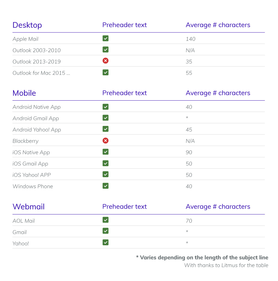
Preheaders add valuable context to your subject line, enticing your contacts to open your email message. Together with the subject line, the preheader is the first point of contact between your contacts and the email message in their inbox. Often the preheader will contain a short summary, a link to the email message’s browser rendering, a call to action and/or will be an extension of the subject line.Keep the preheader text short and sweet. The most commonly used email clients display the preheader text under the subject line in your contacts’ inbox. The length of the visible preheader text is determined by the email client and the screen size of the device the email is opened on. When a preheader is too long, the email client will simply cut off the rest. Mind you, when it is too short, the email client will automatically include the next text from the email’s HTML.
Want to add a preheader text and add a “View in browser” link to your email message? But only want to display the preheader text under the subject in the inbox? Then place the preheader text in front of or above the “Show in browser” link in your email message.
Adding alt text to all images
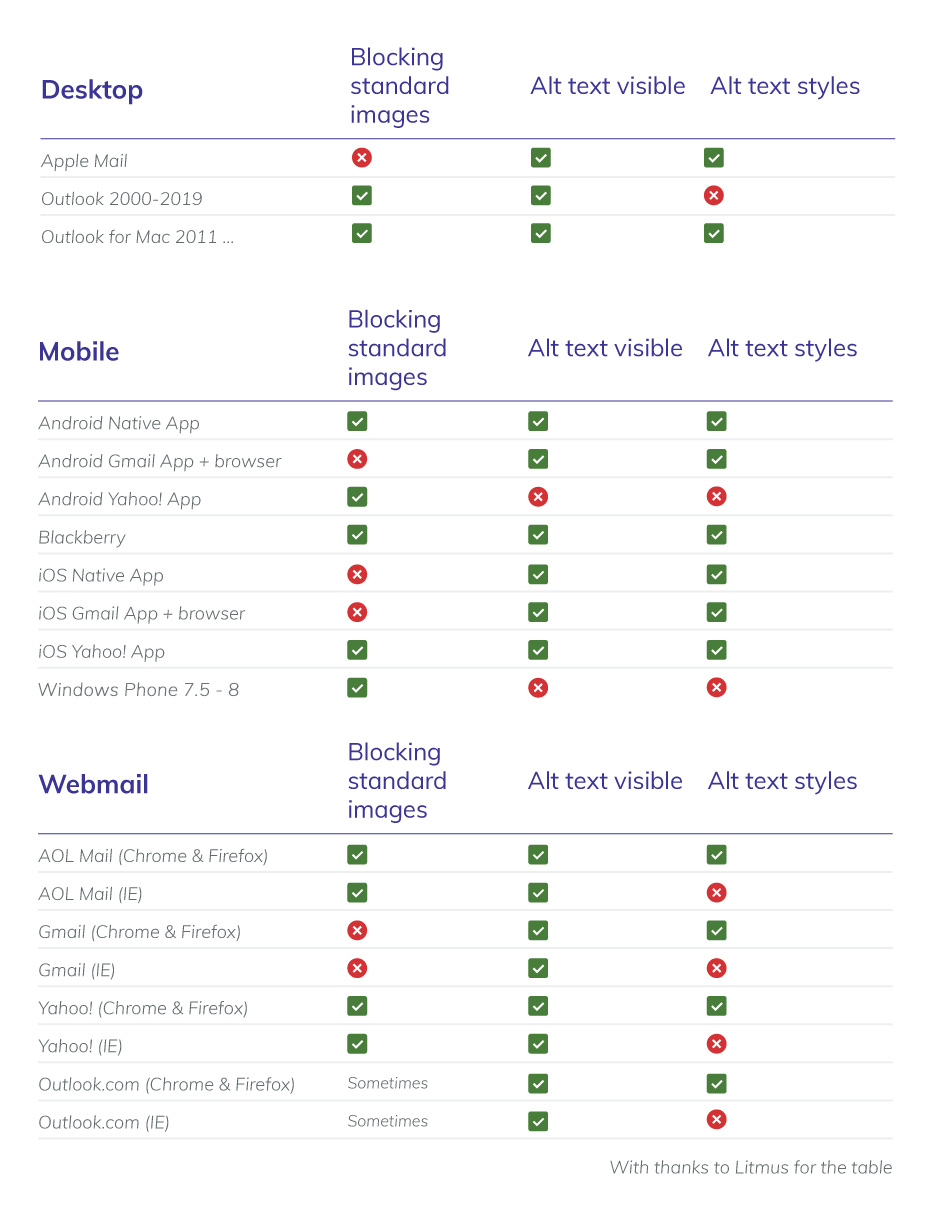
It is not uncommon that images in an email message are not (cannot be) uploaded, on the one hand, because some email clients block images automatically to prevent spam and, on the other hand, because of recipients’ own settings. To prevent that your email message ends up in your contacts’ thrash without so much as a by your leave, it is essential to add alt text to all your images. By using alt text, your contact will understand what the full email message is about and/or what the image in question relates to. Alt text can also arouse your contacts’ curiosity and encourage them to accept the images and/or to view the email message in their browser.Add alt text that adds a certain je ne sais quoi to your email message just in case your images are not uploaded. If an image contains text already, then copy that text in alt format under your image. This ensures that your text will be legible.
Some email clients will even allow you to create alt text in suitable style.
Email messages consisting of one single image into which text and calls to action were incorporated will more often than not end up in the spam folder and/or trash. Once the image in question has been blocked, no content whatsoever is displayed.
Using email-safe fonts
A font can make or break your visual identity. While images may often be blocked automatically, fonts are displayed immediately. This makes it incredibly important to choose an appropriate font. Designers with a love for typography like nothing better than choosing a suitable Web font. Unfortunately, this may not always be the best route to go down if you want your email message to be displayed correctly. Fact is that the overall majority of email clients quite simply don’t support them. If you want to be sure that the font you have chosen is displayed correctly, opt for an email-safe font such as:Arial, Arial Black, Bookman, Calibri, Century Gothic, Comic Sans MS, Copperplate, Courier New, Garamond, Geneva, Georgia, Helvetica, Impact, Lucida Sans Unicode, Palatino, Tahoma, Times New Roman, Trebuchet MS or Verdana.
In sum, we strongly advise against using Web fonts. If you want to do so anyway, don’t forget to set a suitable email-safe font as fall-back font. A number of email clients have their own fall-back font. Apple iOS Mail uses Helvetica while Gmail uses Arial. Also within the Flexmail application, measures have been taken. Emails designed in the Smart Builder automatically get Helvetica or Arial as fall-back fonts.
Generating a text version of your email message
The text version of your email message is always displayed correctly, whatever the email client. As this version does not contain any markup or images, you avoid that the image is displayed incorrectly. Some people simply want to receive a basic email message without bells and whistles and, accordingly, will simply opt for the text version of your email message.By generating the text version, you reduce the chances that your email ends up in the spam folder. With a text version of your email message, you will more readily be regarded as a reliable sender.
And no, we haven’t forgotten you!
If your emails are mainly read on mobile devices, the following tips & tricks will be of use to you.- Design your email message using one column only.By using a single column, you prevent that your contacts will have to pinch and zoom to find the content they are looking for. These days, people don’t go looking for information anymore as they expect to find it at a glance.
- Keep it simple!
- Make your calls to action large and clickable.Apple recommends using buttons that are at least 44px in size, i.e. the size of a human fingertip.
- Use pictures and images that catch the imagination.When your contacts scan through your email message, they must be able to instantly understand the content.
- Set your text size at 16px.
- Test your email message. Emails are not always easy to read on mobile devices. You only get one chance to impress your contacts. Is your email not all that easy to read? If so, your email message will be ignored, deleted, or worse still, marked as spam.

