Looking to generate leads with your marketing campaign? Then you need a great landing page. We'll show you how to craft the perfect landing page online. Ready?
What makes a great landing page?
Anyone advertising online or working on marketing campaigns knows the importance of a good landing page. It's where potential new customers land once they've clicked on your ad.A landing page isn't just for ads. It could be where your subscribers end up after reading your flashy newsletter and take the next step.
Time for action
Visitors to your landing page need to be prompted to take action! Enough with the blah blah; it's time for the boom boom. 😁 Think about selling a product, claiming a promo code, or reading your latest blog post...
The goal of a landing page is to prompt customers to take a specific action.
In another article 'What is a landing page', we discuss the theory behind landing pages.
Regardless, remember that these pages often focus on one specific topic or product. To keep things simple and not overwhelming, landing pages usually have a simpler content and layout than a homepage or product page.
A perfect landing page usually includes a clear call-to-action (CTA) button. That's the ultimate way to prompt your visitors to take action.
What should a landing page include?
Are you planning to create a good landing page? Then it's important to know what a good landing page should include.No matter how big or small, each element plays a crucial role in completing the puzzle that is your landing page! It's not a puzzle you solve in no time; a good landing page goes far beyond sharp copy or stunning layout.
Ensure ...
- a clear value propositionA landing page must have a clear value proposition where you communicate the offer clearly and directly. This is inseparable from a 'promise', the concrete promise of what a visitor gets when they respond to your offer.
Furthermore, a landing page with a clear value proposition emphasises the features, benefits, and above all, the unique factors of a particular offer. It's about a unique aspect because it's the first impression leads get of your product or service.
The clearer and more unique your value proposition, the quicker customers understand what you have to offer. "Wow, that's worth it", that's the impression you want to evoke. When you think about the value proposition, you usually analyse the needs and concerns of your target audience. How can you make a difference with your offer? - a beautiful designCreating a good landing page means ensuring a beautiful design. You need a professional layout that incorporates visual elements such as images and videos. With a perfect design, you strengthen your message even more.
- compelling contentWhat's a good landing page without strong content? 😉 If your text and visual elements are convincing, visitors will find what they're looking for much faster.
It's important that readers can easily scan the content. Therefore, use bullet points, whitespace, subheadings, and short paragraphs.
By creating both convincing and engaging content, your landing page will have a lower bounce rate. You'll keep your visitor's attention much longer. So, don't forget to include strong headlines, striking images, and/or 'captivating' customer reviews on your landing page.
This feature is crucial, of course, to shape and reinforce the value proposition of your page and product. - a clear Call-To-ActionA strong landing page must be concluded with a clear Call-To-Action at the end (it can also be in another prominent location!). Make that button clear and ready.
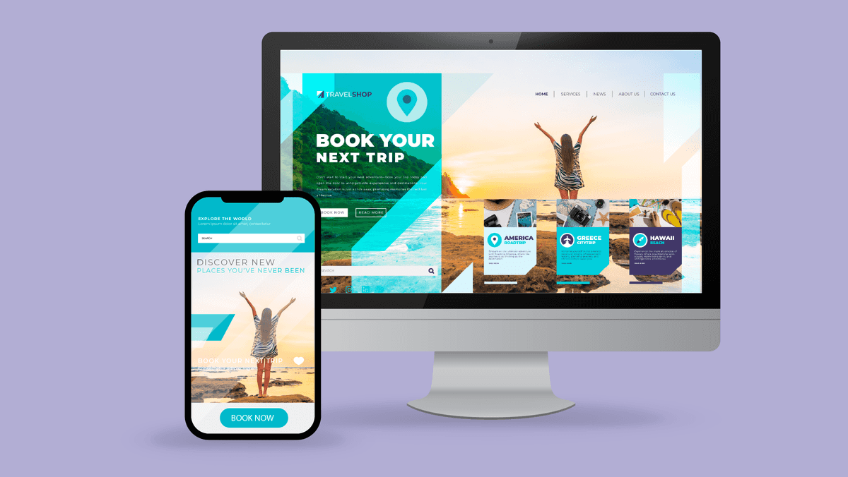
"Sign up today", "Buy now", 'Quickly claim your discount code" ... Phrases like these prompt visitors to take the desired action. - a mobile-friendly landing pageA mobile-friendly landing page is important because more and more visitors are going online via mobile devices such as smartphones and tablets.
It's absolutely not done to provide a landing page with unreadable text or awkward navigation. Your visitors will click away much faster, which doesn't benefit your marketing efforts.
By ensuring that a landing page is mobile-friendly, the user experience is improved, resulting in higher engagement and more chances of that important conversion taking place!Read also: what does the perfect email look like?
A high-converting landing page includes a clear Call-To-Action.
How to create a landing page?
For those paying attention, you already know: a good landing page should prompt customers to take action. Well, speaking of action ... It's time to get started yourself! 😁Now that you know which elements are essential, you can begin creating your own landing page.
Step 1: Analyse your audience
First think, then create. Because before you set up a landing page, you need to first consider the needs of your target audience. What are they looking for? Which channels are they active on?By better understanding your audience, you can tailor your landing page (from content to design) to what your audience needs.
This way, you increase the chance of converting leads. In this article, which focuses on content strategy, you can read more about determining your target audience.
A powerful landing page has a clear goal.
Step 2: Define your objective
What's a good landing page without a clear objective? 😉 By this, we mean defining in advance what you want to achieve with your landing page. Of course, everything depends on your marketing campaign itself.Most likely, you'll want to gather new leads, boost product sales, attract subscribers to your newsletter, etc. By devising that goal, you can align both the content and layout accordingly.
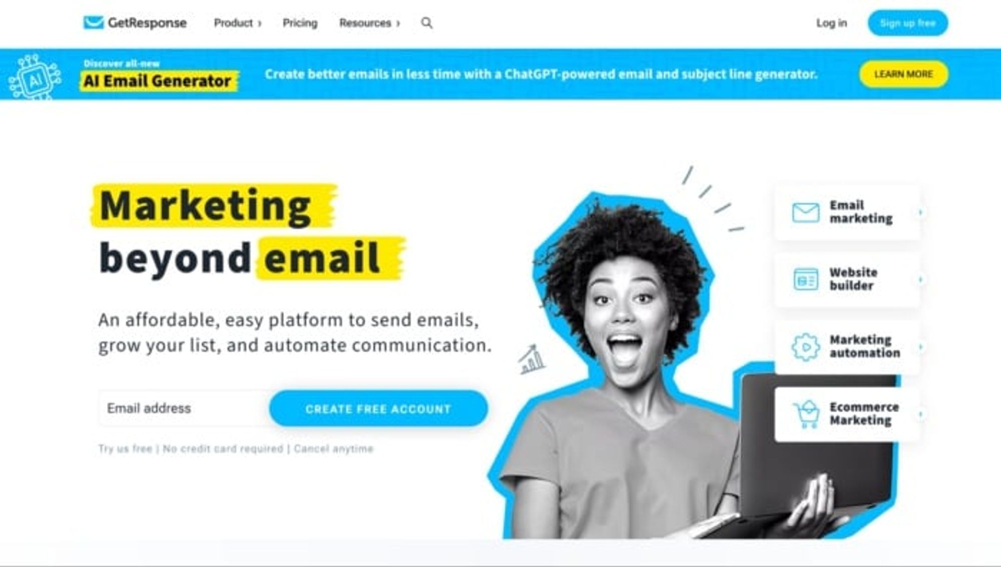
On a landing page, you can highlight a product or service.
With a strong objective in mind, focus on what your landing page needs to achieve the desired result.
Later on, you can measure conversions and see for yourself whether visitors have taken the desired action or not.
Step 3: Start with the content
It's time to start filling your landing page with content. Although content and layout are inherently linked, it's better to focus on text first.What's on your page should directly resonate with the target audience you have in mind. Interesting information to provide includes the benefits of the product and its unique features.
For instance, if your goal is to get more subscribers to your newsletter, you can clarify what promotions your newsletters contain.
Make sure your content is easily 'scannable'. Scannable text means providing enough whitespace and structure. Also, think about bullet points, subheadings, and short paragraphs.
Step 4: Add the Call-To-Action
"How do I create a landing page with a strong Call-To-Action?" Well, by formulating your CTA clearly, making it action-oriented, and seamlessly aligning it with your objectives. To complete it all, provide an eye-catching button. 😀Step 5: Design your landing page
Ensure the right balance between content and layout. Landing pages generally have a simple structure with minimal distractions. Make sure the design aligns with your company's branding and matches the style of the ad or campaign linked to the page.Internet users are visually oriented, so think carefully about which meaningful images and videos you might want to display on the page. If you have a customer case (something like a testimonial) on your page, you can enhance it by integrating a video related to the case on your landing page.
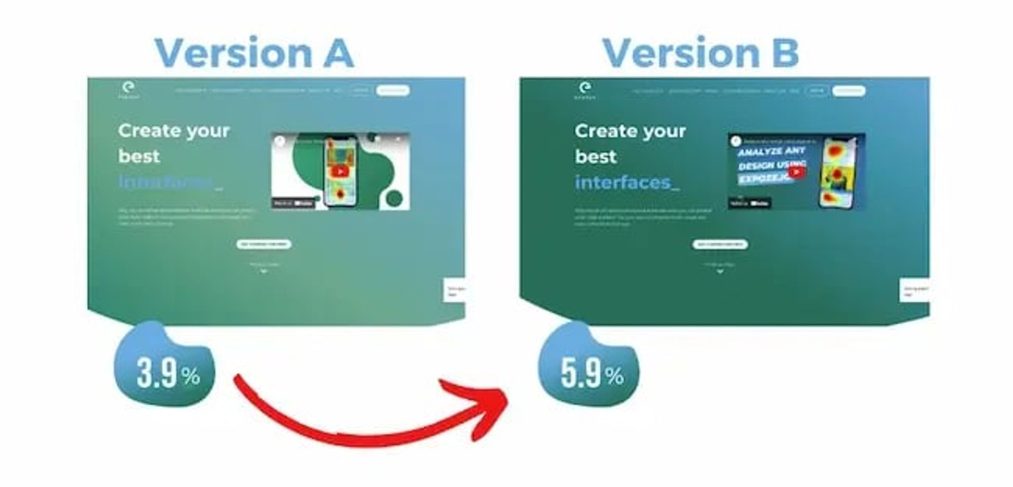
You can set up A/B tests for specific landing pages.
Step 6: Conduct an A/B test
Once your landing page is ready, consider creating a second version of the page. With this, you can conduct A/B tests. You can experiment with various elements of your page such as title, text, images, colors, and CTAs.By having different versions of the landing page, you can test which version achieves the best conversion rate.
Crafting your landing page: unmissable tips!
With these tips for a good landing page, you leave nothing to chance. Score with that landing page!- Incorporate sufficient conversion-oriented elements on the pageA good Call-To-Action on your landing page is crucial. But you can also add other conversion-oriented elements. In a subtle way, you encourage visitors to take even more action.
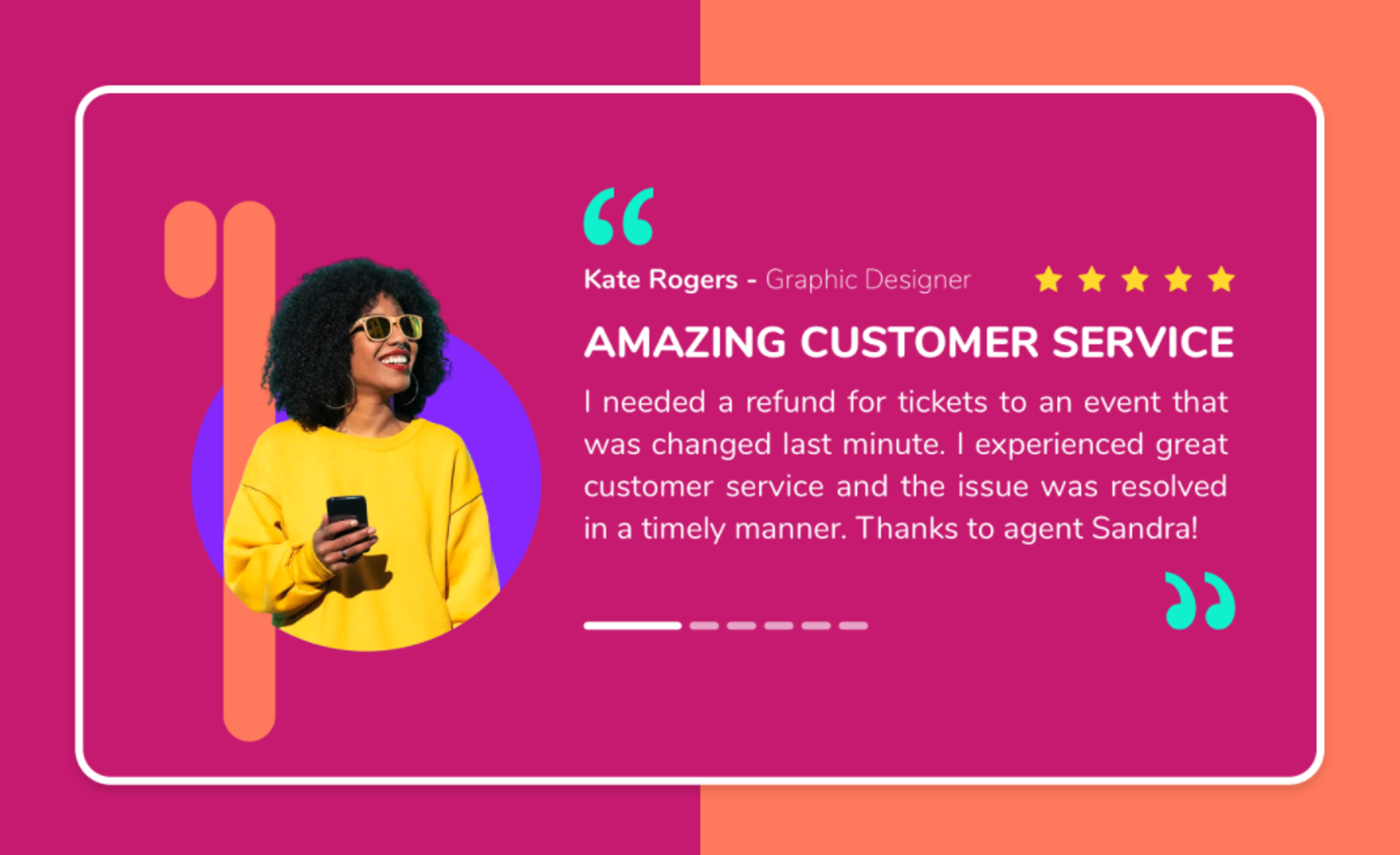 Testimonials are a good example of social proof.
For example, integrate a form into your page or add 'social proof' such as reviews, customer cases, and testimonials. Behind the scenes, working on responsive design and an excellent user experience also contributes to more conversions. - Alignment between ads and landing pageImagine: users see your ad, click on it, and land on your landing page. But on your page, they suddenly see completely different content. This confuses your potential customers and jeopardises your credibility.
Ensure consistency between your ad and your landing page. If someone clicks on an ad, they have certain expectations. You need to fulfill them, otherwise, you'll miss your goal. - Ensure optimal loading speedAnyone interested in your ad and landing on your page should immediately see the right content. The slower your website, the higher your bounce rate (visitors who leave immediately after clicking). Loading speed is crucial. With these tips, make your website faster.
- Craft a powerful titleA good landing page needs a powerful, preferably eye-catching, title. So, come up with a headline that grabs visitors' attention.
Stir their interest to keep reading. Does your product make your customer's life easier? Is there a unique promotion? Either way, it's a smart idea to incorporate attention-grabbing elements into the title. - Avoid distractions for visitorsAnnouncing your latest product with bells and whistles? You're enthusiastic, we get it. But there are other ways: a blog article, a social media campaign... On your landing page, it's better to keep it clear and clean. Avoid distracting elements!
So, you must dare to look critically at your landing page. Or let others take a thorough look at it. Is there too much information? Could the design be improved? Is that CTA clear enough?
Once your visitors are distracted, your chances of conversion diminish. So please, put online a landing page that makes sense, is easily readable, and has a professional design.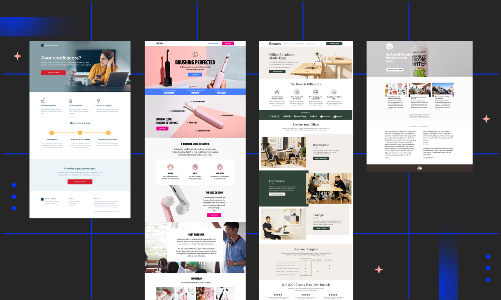 What does a good landing page actually do?
We're fans of these landing pages 😀
You might be looking for some inspiration. Which brands or organisations really have great landing pages online, you wonder.Below, we'll show you three examples of landing pages that we here at Flexmail are big fans of. Feel free to take inspiration - strictly with your eyes only!
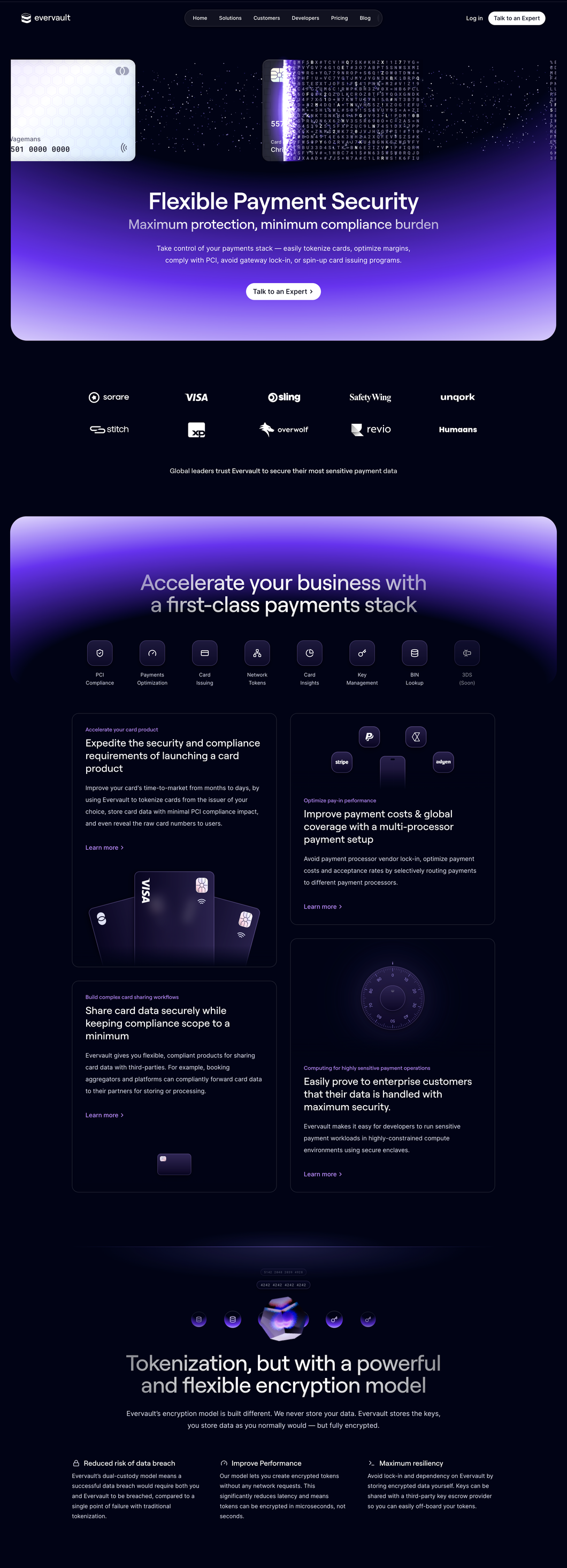
The following landing page is created by Evervault and is the top favorite of our product manager.
The next landing page that shouldn't be missing from this list is the one from Branch.
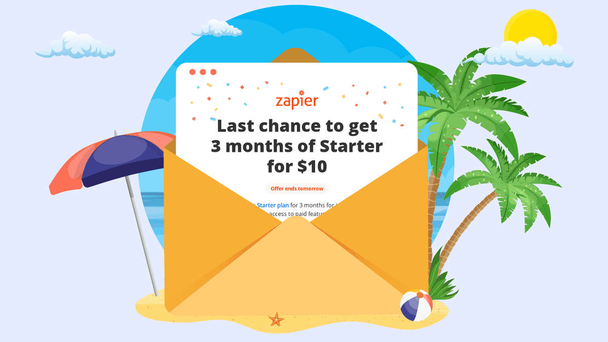
Lastly, we're also fans of the landing page(s) from Zapier.
Create landing pages for free
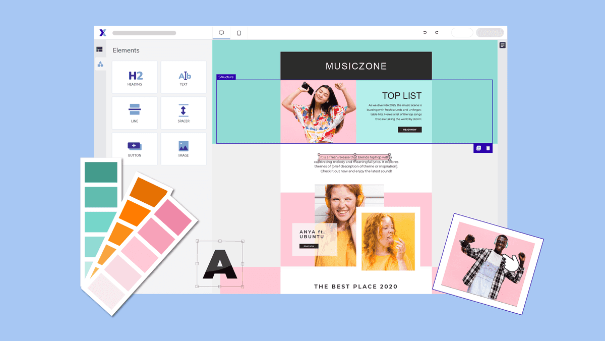
Since we're on a roll: at Flexmail, we go the extra mile to help you out! You can design free landing pages with us that are perfectly tailored for email marketing.Boost your conversions and products through landing pages. Start with a template or build your own landing pages by dragging and dropping various elements and structures. Show exactly the content your visitors need to take action.

Would you like to try Flexmail?
Design mails tailored to your needs, reach your target group, and learn from the proper results.
Get a free trial now Jasper Van Biesen
