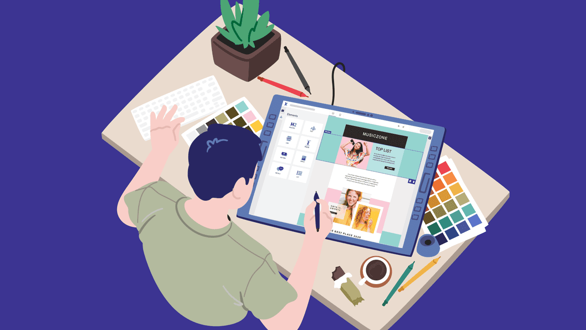
Have you ever looked at an email and thought, "That really doesn't look good"? As a marketer, you know that the visual appeal of your email campaigns is crucial for reaching and engaging your audience. But what do you do when graphic design is not your strong suit? Don’t worry! With our new drag & drop email builder and design tips, even non-designers can create professional emails in no time.
Professional emails are an absolute must
Newsletters and mailings are hot, and they will remain so! Email marketing is incredibly important for anyone communicating with customers, subscribers, and leads. You know that, we know that... but your competitors (and the rest of the business world) know that too. Just check your own inbox; we bet it’s overflowing with unread newsletters.What you need to do? Stand out! But stand out the right way. Subscribers who are unsure whether your emails are spam or not... You may get noticed, but not the way you want. That’s why professional-looking emails are so important.
Send out newsletters with a neat layout, strong copy, a clear structure, and a compelling look and feel. All these elements combined strengthen the message you want to convey.
Even non-professionals can design stunning emails
But what if you're not a designer? Can you still create professional-looking emails? Absolutely! There are many tools and templates available today that allow you to create professional emails easily, without design or technical skills.Take on the challenge! With the right tools, you can design amazing emails with minimal effort and time. Honestly? It's a must! In email marketing, you need to stand out in your customers' crowded inboxes.
Our design tips for non-designers
With our tips and tricks for non-designers, you’ll create strong emails that are not only visually appealing but also capture your reader’s attention. We’ll show you what to focus on when designing professional emails and help you avoid the pitfalls that amateurs – or, as we prefer to say, pros to be – sometimes make.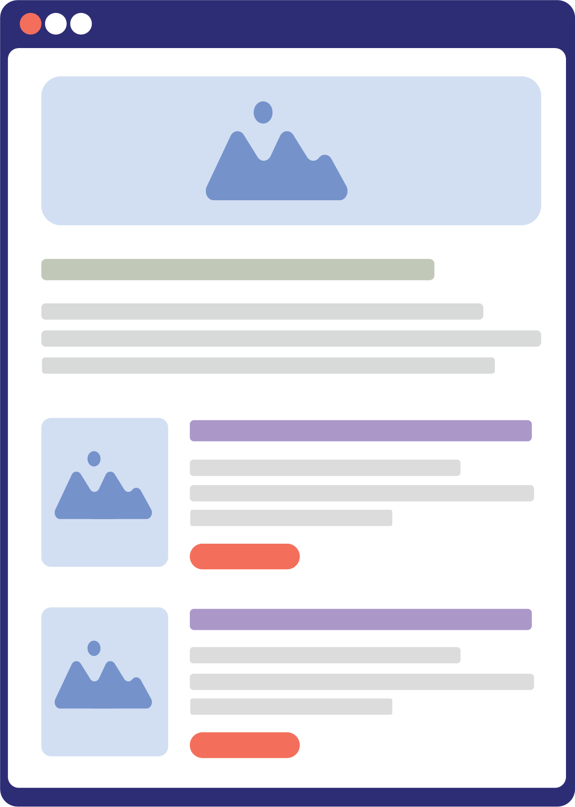
Tip: Follow the simple basics
Don’t overcomplicate things. If you're not a designer, it’s essential to follow the simple basics when designing emails.Start with the structure. By structuring your emails, you create a clear visual hierarchy. Think of your subscribers as scanners rather than readers. A well-structured email gives them all the information they need in a nutshell, without boring them. This hierarchy helps your reader quickly scan the main points of the email and makes your content clear and appealing.
How? Use larger and clearer headings to immediately grab attention. Strategically placed buttons and links that prompt readers to take specific actions are also a must. A consistent style throughout the email – such as uniform colors, fonts, and margins – creates a professional look and builds trust in your email.
Tip: No copy-paste, but drag & drop
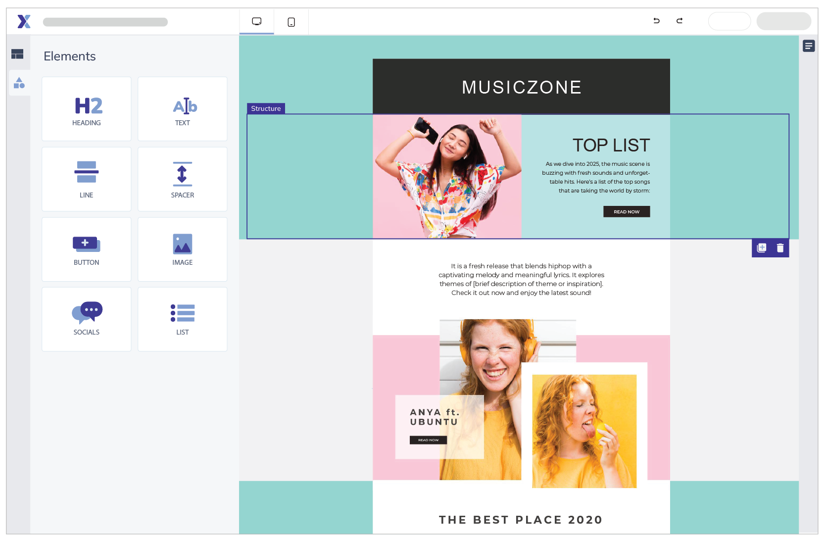
Let’s bring in our most handy tool! The Drag & Drop Builder is the most popular design tool in Flexmail.With our Drag & Drop Builder, you can create stunning emails in no time by dragging and editing elements on the canvas. You only need to add your own text and images. Customize the look and feel through the settings.
Use one of the templates or start from scratch. You can use the saved time to experiment with the layout or create goal-driven content. Thanks to the pre-designed structures of the Drag & Drop Builder, you’re already more than halfway to creating your perfect email. Sounds good, right? 🙂
Try it for free!
Tip: Speak with colors
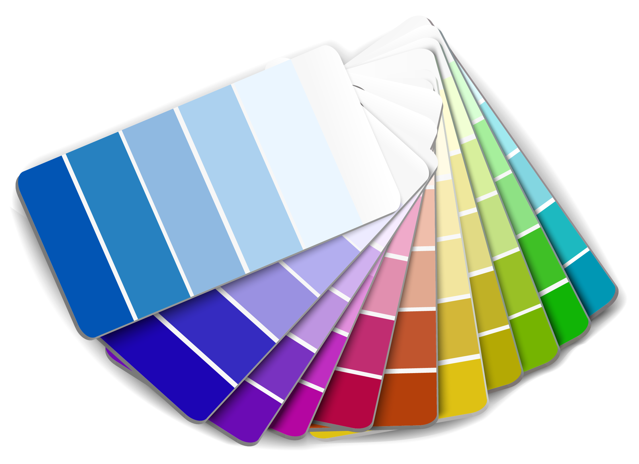
Research shows that color usage can increase recognition with your customers by up to 90%. So, it would be absurd not to use colors, right? Always incorporate your branding into your emails. This builds trust with your contacts.You’ve probably noticed that here at Flexmail, we always use two primary colors: blue and orange. The norm is to use no more than three colors in your design. You’re designing an email or newsletter, not a coloring book. 😁
Use a color scheme and follow the 60-30-10 rule:
- 60% of a dominant color;
- 30% of a secondary color;
- 10% of an accent color.
By the way: when it comes to emails, it’s better to go with ‘Less is more.’ Don’t overwhelm your subscribers with all the colors of the rainbow, unless that’s part of your branding, of course.
Tip: Choose the best font
The majority of your newsletter, of course, consists of text. But keep in mind that your text isn’t always read! Most contacts scan your text and don’t read it carefully.Choose a font that is easily scannable. Be careful in your choice, as you need a font that matches your overall branding. Stick to a maximum of three fonts from the same family for a consistent look.
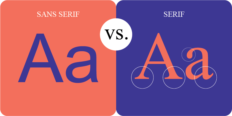
Consider these two types of fonts:
- Serif fonts
These fonts have a "serif," which is a small line or stroke at the end of a letter. These are more classic fonts and convey trust, tradition, and respect. They are often used by older brands that want to express these feelings. Be careful: it can be risky to use them in emails because the serifs might not render clearly on pixels. - Sans Serif fonts
These fonts are the opposite of Serif fonts and, as you guessed, don’t have a serif. They don’t have small strokes and appear more modern. They’re clean and clear. These fonts are ideal for your email because you won’t have issues with pixel clarity. Besides being reliable, they also appear minimalist and accessible.
- Readability: Ensure that your content is easy to read; otherwise, you won’t get any conversions.
- Clarity: Stick to Sans Serif fonts and use larger, clear font sizes with enough line spacing.
- Feel: Tailor your font to the tone of your message; a trustworthy appearance can help drive clicks
- Consistency with branding: Use the same font across all your channels for recognition, and make sure it fits your target audience and industry.
Tip: Establish hierarchy
We need to talk about scanability once more: to grab attention quickly, your message must be clear and appealing. You create the right hierarchy by varying size, weight, and color in your design. Readers will spot regular text and (sub)headings much faster this way.To optimize readability, especially on mobile devices, it's important to maintain the ideal line length of 50-75 characters. Want to further enhance the reading experience? Make sure to include sufficient line spacing, ideally 1.5 times the font size. You don’t want cramped text blocks, do you?

Tip: Write strong copy
Just like an attractive design, the content is crucial. Is your content relevant to your audience? Does your copy draw the reader in? Struggling with writing compelling texts? Check out our webinar on copywriting and you'll be all set!Strong copy addresses the needs and interests of your contacts. Who knows them best? Your recipient, of course! If certain information is really important, such as a date or price, highlight it with bold text or repeat it in your title and/or image.
What you need to keep in mind: don’t overwhelm your readers. Too much is never good. Regardless of the device or reading conditions of your contact, you must always ensure that your email is easy to digest.
This translates into a variety of choices:
- Keep sentences short and paragraphs concise.
- Ensure that line height is large enough for people to easily scan your text.
- Make sure there is enough contrast between your text and background color.
Tip: Use white space
If you're more of an entrepreneur than a designer, we understand that the temptation to fill your newsletter with information can be strong. Think like a pro: they know that white space is crucial for a calm and balanced email design. It's important that there is enough breathing room throughout your design.White space breaks up your text into sections, marking the beginning and end of a topic. It also makes your text more readable.
In addition to margins, padding helps to create white space. Padding is the white space you add within elements. Think of the space between the edge of your button and the text inside that button.
Tip: Use high-quality visuals
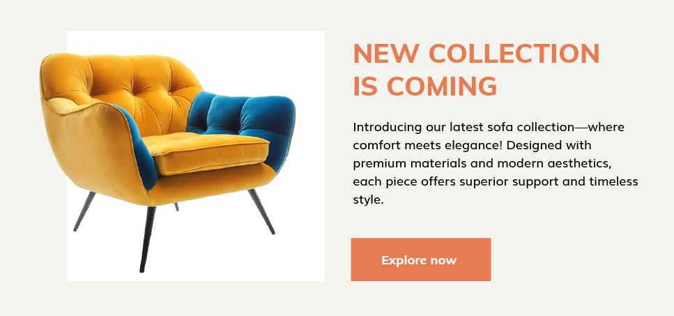
Nothing is more frustrating than a blurry image or unclear text! Keep it professional and use high-quality images. Don’t overdo it with flashy images. Choose beautiful but simple images that highlight your product or support your message. If you're using certain icons or illustrations, make sure these visuals align with your brand and style.A picture is worth a thousand words, and that saying is definitely true. But please, never fill your newsletter with logos and random stock photos that don’t fit your brand. Why not take a subtle approach? Also, be careful with image blocking.
Also, consider the height and size of your images before inserting them into the email. Pixelated images, caused by enlarging pictures that are too small, look unprofessional. On the other hand, overly large images can slow down your email’s loading time. By optimizing your images for web use, your readers will appreciate that you are not consuming their data when they try to open your email.
Learn how to create an email marketing content strategy step by step
Tip: Place your Call-to-Action in the right spot
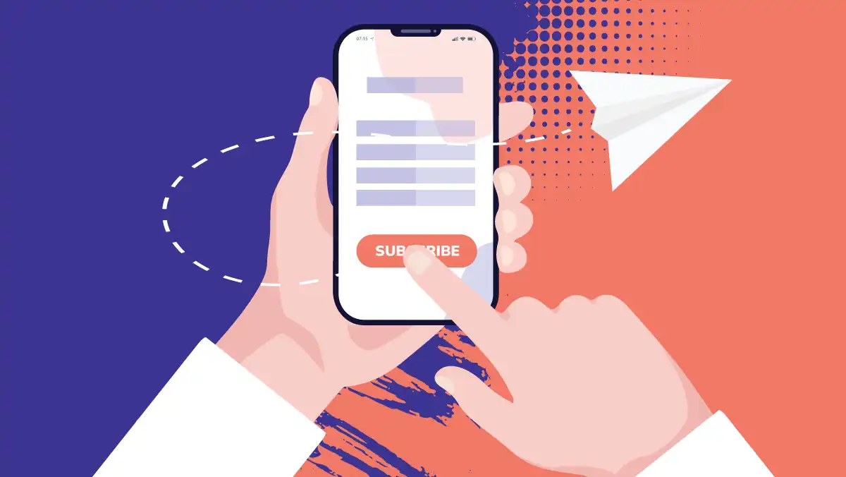
You send an email because you expect something from your customers. Do you want to inform them about your latest product? Or perhaps communicate about a service, event, news, or blog post?In these cases, you want the action you want your reader to take to be very clear, namely clicking on that one important button! Your CTA is the bridge from their inbox to your landing page, so you need to build that bridge solidly.
There are two types of CTAs: emotional and functional. Emotional CTAs trigger curiosity and emotions, encouraging subscribers to click. Functional CTAs, such as links in logos, headers, or social media icons, serve a practical function and clearly point to external sites.
Follow our 11 tips for strong email CTAs
Here’s how to create effective CTAs:
- Goal-oriented: determine what you expect from the reader. The CTA should offer value, for example, "Download your personal report" instead of "Read here."
- Eye-catching and mobile-friendly: ensure that the CTA stands out with a contrasting color, appropriate size, and a central position for easy access.
- Repetition: don’t hesitate to repeat your CTA a few times. If you have multiple CTAs, work with both primary and secondary buttons.
Tip: Make your emails mobile-friendly
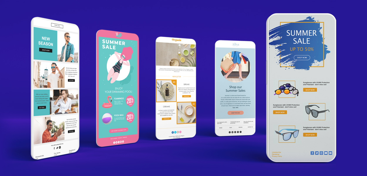
Your emails need to look good on different screen sizes. It’s even a matter of mobile first, as most readers check their emails on their smartphones. Within your responsive design, ensure that your CTAs are easy to click and your text is legible. UMake sure that elements and buttons have sufficient padding.Learn more about how to make websites and emails mobile-friendly
After the tips: Final touches and testing!
Once you’ve started working with our email tips, it’s crucial to finish and test your emails down to the last detail.Get even more tips & tricks to make your readers click in our design webinar
By finalizing, we mean:
- Ensure all elements are aligned on an invisible grid.
- Check padding and margins (if the builder allows it).
- Add contrast (both in color and size/shape) to grab attention.
- Verify the alignment of all elements.
- Check if your branding is present (but not overdone).
- Repeat the CTAs in enough places.
- Ensure your emails look clear and easy to digest.
- Check if you’ve used your standard colors and fonts for a consistent >tone of voice.
- ...
- Test if your email looks good across different email clients (Outlook, Gmail, etc.).
- Check if your email works and looks good on (different) mobile devices.
- Ensure your images and CTAs display correctly on smaller screens.
- Make the layout responsive.
- Optionally, conduct A/B tests to analyze which types of emails have the most impact.
- Check if all URLs behind images and buttons work and are correct.
Try it for free?
Clear emails with strong content make people click. After reading this blog post, you’ll see that you don’t need to be a super-talented designer to create such professional emails.Our drag & drop builder takes care of all the technical specifications for you. You can focus on the content that will help you reach your goals. Good luck!

Would you like to try Flexmail?
Design mails tailored to your needs, reach your target group, and learn from the proper results.
Get a free trial now Jasper Van Biesen