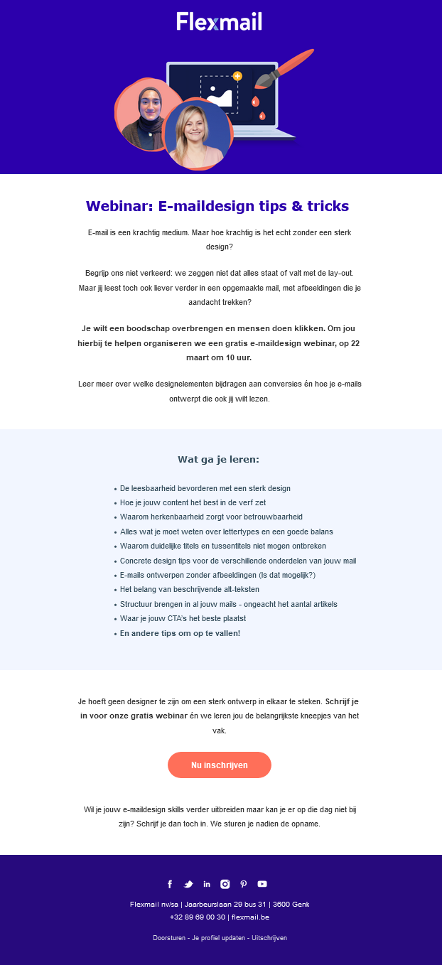
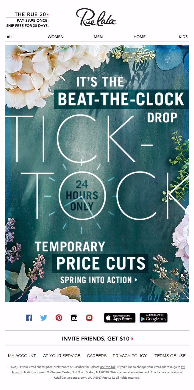
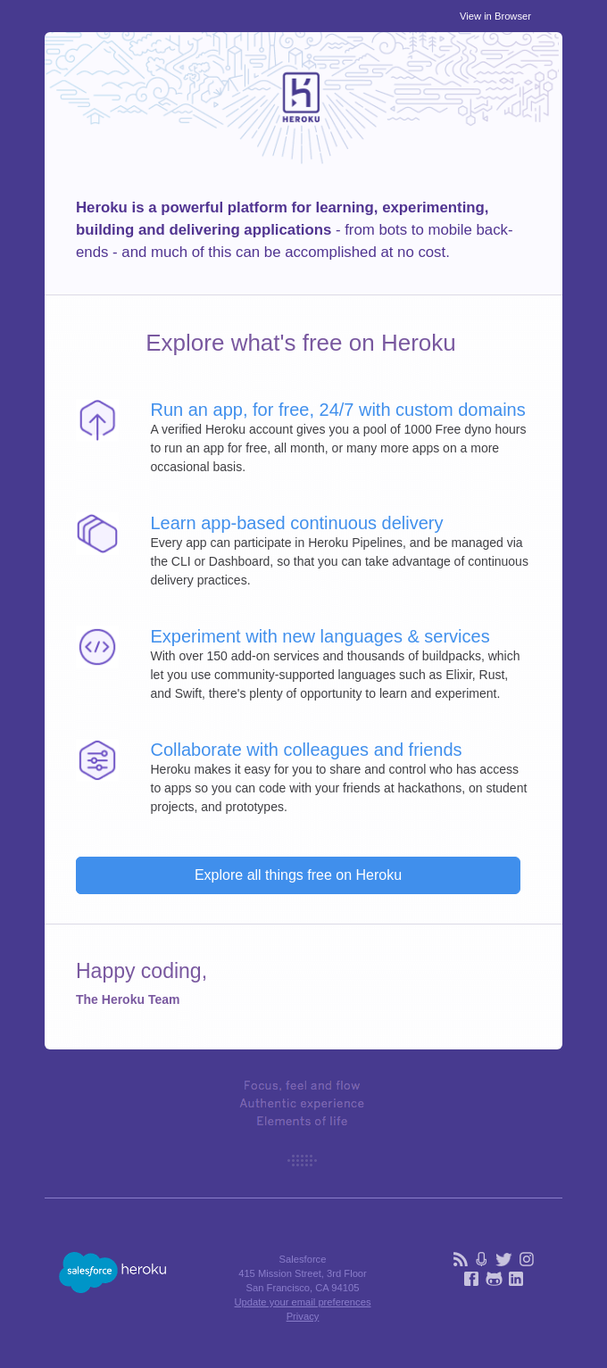
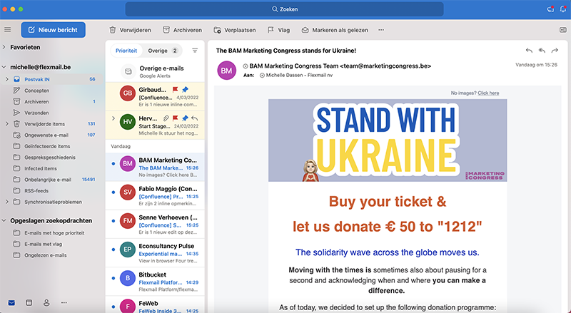
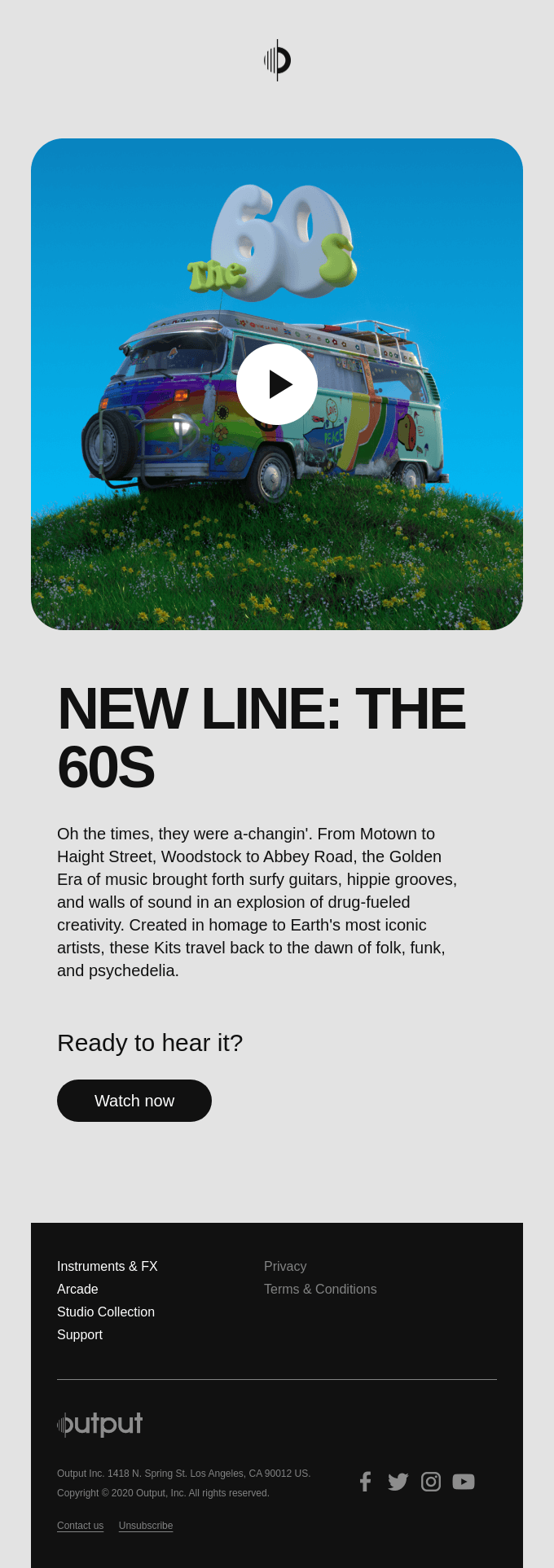
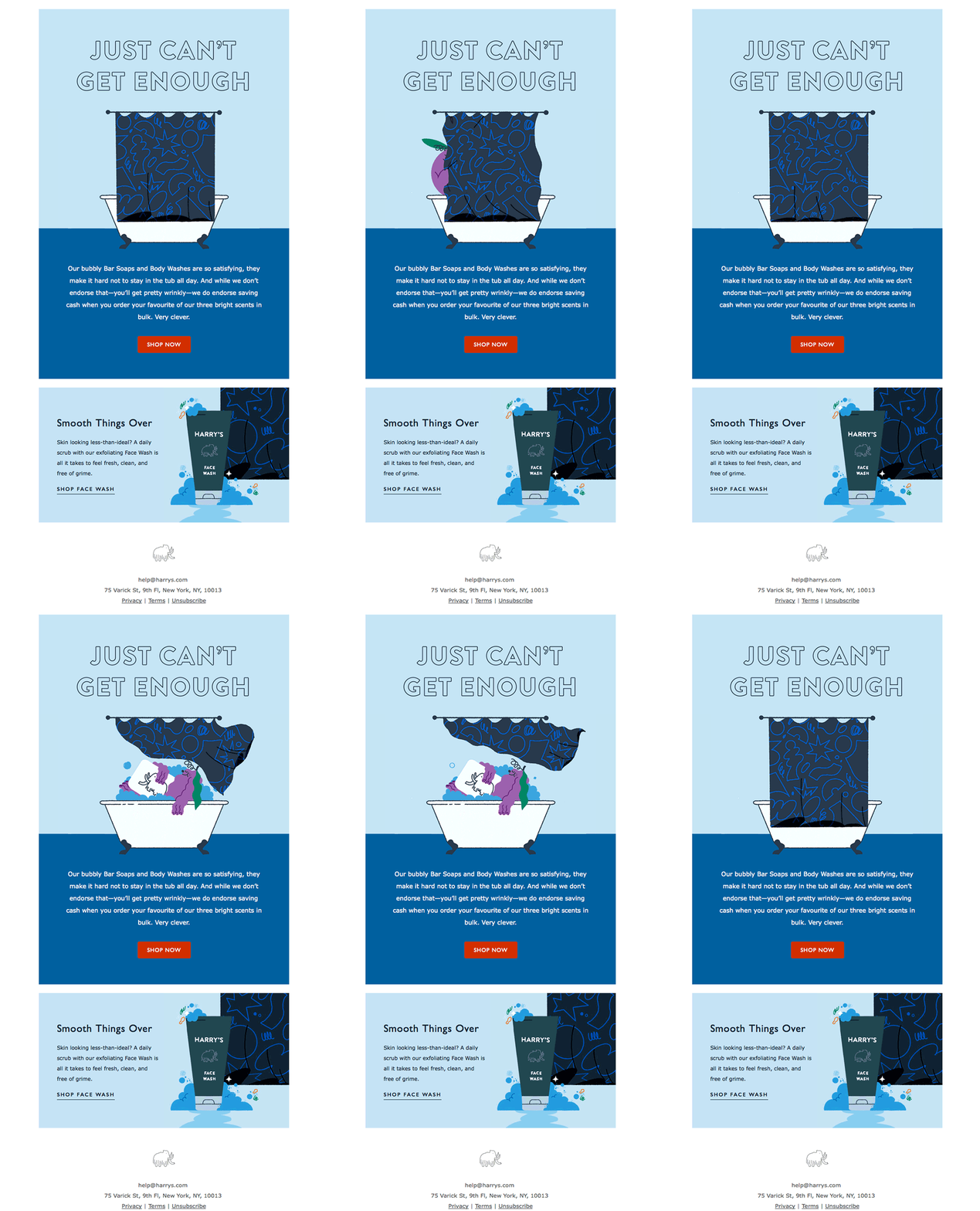
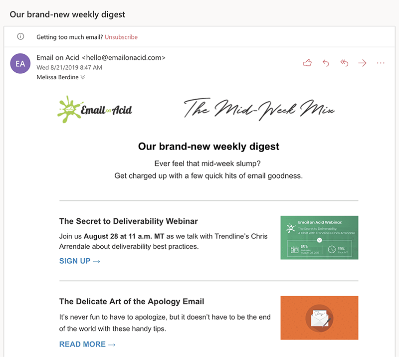
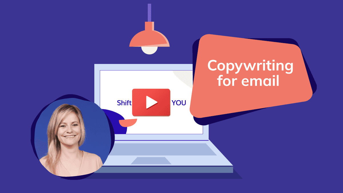
Did you not have the possibility of participating in our email design webinar, at which we provided all tips and tricks for an optimum and aesthetically attractive design? We list the major points especially for you, with some examples, of course. You can read them in the blog below, or you can watch the recording of the webinar.
How to create an effective design?
Everything depends on a good strategy. Your content and design should make up a whole.1. Is your content captivating?
An attractive design is important, but what about the content? Is your content relevant to the target group? Does your copy draw in the reader? Is writing captivating texts hard for you? Make sure you check our copywriting webinar, and everything will be fine!2. What do you want to achieve?
Before starting on your design, you define the object of your email. What do you expect from your contacts? Do you want to inform them? Do you want them to take action? Once you have found an answer to these questions, you can start with your design, as everything is based on this. If you expect an action from your readers, all elements should guide them to the respective button.All design elements summarised
What can you use to make your catchy text stand out? We list everything here, with best practices. Scroll further to turn your emails into masterpieces!The backbone of every design: the layout
The layout serves the purpose of drawing the reader’s attention and of optimising readability. This does not necessarily mean it has to be dull. A creative design with a well-structured layout can be highly effective. Your layout consists of various parts. We will discuss them one by one.Colours speak louder then words
It has been found that colours increase the recognisability for our customers by up to 90%. So wouldn’t it be absurd not to use them? Always include your branding in your emails and other social media channels. This will also create trust among your contacts. You will also have noticed that we always use two primary colours: blue and orange.Colours are your best friends in email design. You can use them for anything:
- Divide your text into colour blocks to make the various paragraphs stand out. Use this tip if you want to include multiple topics in your emails.
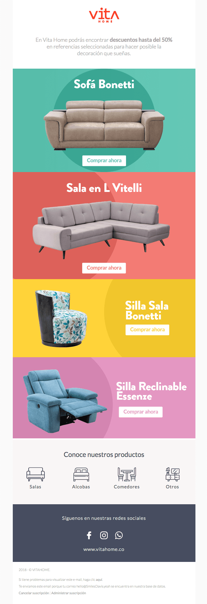
Here is an example: Vitahome is a Colombian furniture business. In the email below, every sofa is given a different background colour. The catchy colours draw your attention, and if you look carefully you will also note the colour contrast that is used. This takes us to the next part of your email design: - You want your call to action to catch the eye. What better way to use for this than contrasts? Make sure your button has the most striking colour on your palette. So do not use it for other elements in your design, as this may make your call to action less noticeable.
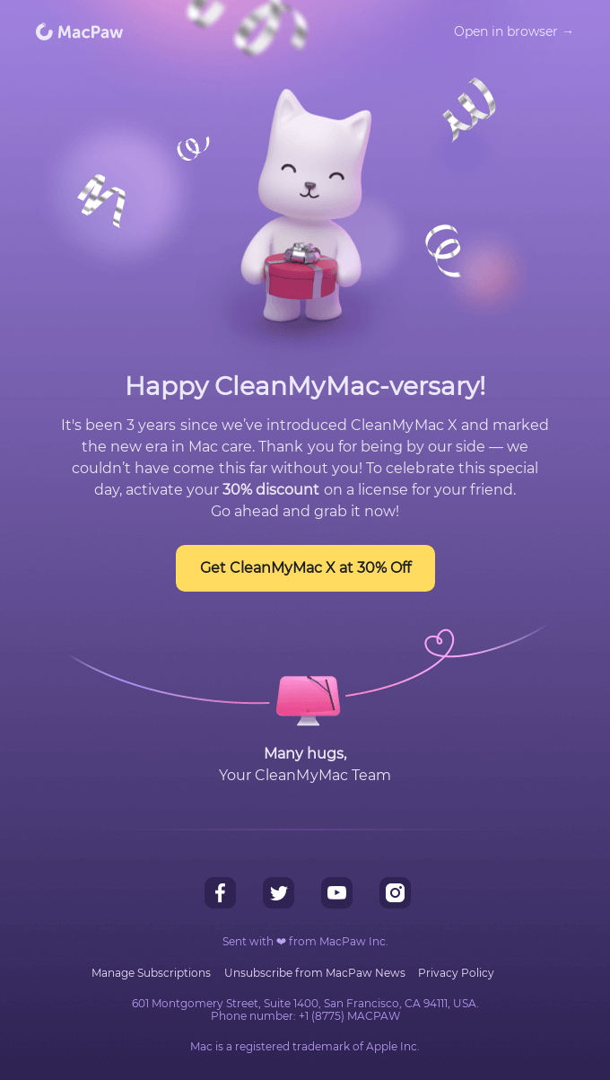
In this example from CleanMyMac, a tool for tidying and optimising your Mac, you can see how a contract is created by placing a yellow button against a purple background. This yellow colour is not used anywhere else, which causes it to get noticed even better. Everything leads to the call to action, and there is no escaping. In this design, they only use two colours. This takes us to the next part: - You are designing an email, not a colouring book! When it comes to emails, less is more. You do not want your reader to be overwhelmed by all colours of the rainbow, unless this is part of your branding. As a rule of thumb do not include more than three colours in your design.
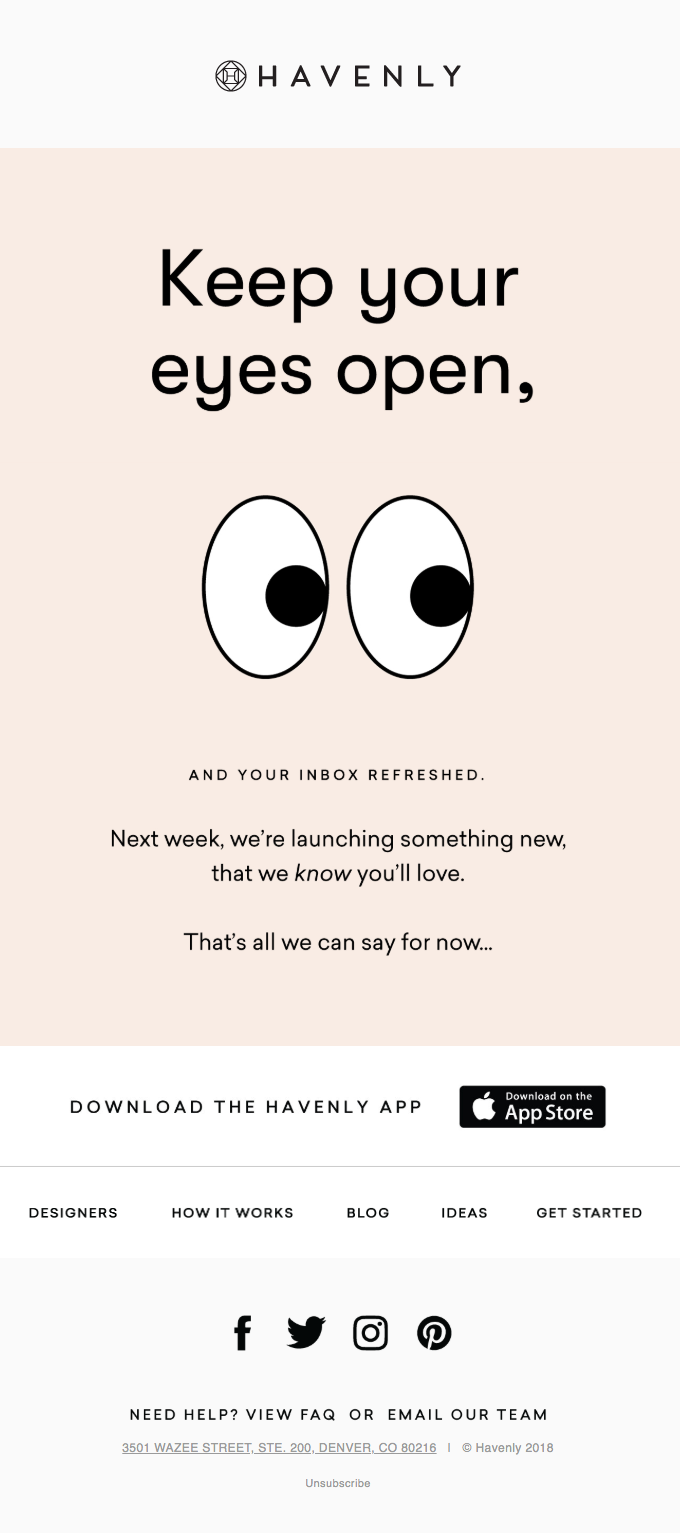
In this example of Havenly, an online tool for interior design, only a light pink hue and white are used to make a distinction. It is fairly simple but very aesthetic.
Comic sans is the toddler of fonts
The main part of your campaign obviously consists of text. But remember that your text is not always read! Most contacts scan your text and do not read it carefully. Use a font that makes scanning the text a lot easier. Also make sure you choose a font that goes well with the total picture of your branding. We distinguish between two font categories:- Serif fonts
These fonts have small strokes (serif) at the ends of the letters. These are the more classical fonts, and they lend a sense of trust, tradition and respect. They are mostly used by older brands that want to convey feelings. It might be risky to use them in your email, as the serifs may be unclear due to the pixels.
An example is this email from Tracksmith, a running gear manufacturer. In this email, they look back on the year 1954. They announce a new collection, one with products that look back on the twentieth century. They want to emphasise the historical aspect and tradition of those days, so they opted for Times New Roman. - Sans serif fonts
Sans serif fonts are – as you may have guessed – fonts without serifs. They do not have the small strokes at the end and look more modern. They are taut and clear. They are the ideal choice for your email, because pixels do not make them unclear. They create a sense of reliability and come across as minimalist and accessible.
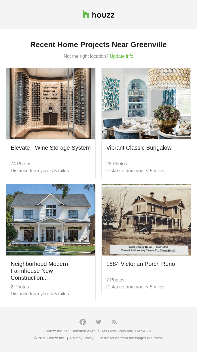
In the example above from Houzz, an online community for inspiration about home decor and renovation, a sans serif font is used. It looks quite modern and basic.
How to choose the best font?
Four criteria may help you choose the right font. Read on and get started!- Can you read it?
We have said it before: if your content is readable, your contacts will be able to scan it more easily. It is obvious that unreadable content does not lead to any conversions. - Is it clear enough?
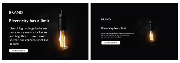
We have already explained that you can logically opt for sans serif fonts in your email. Large fonts, however, are more effective than small ones where email design is concerned. Make sure your letters are thick enough without being bold. Do not forget to pay attention to the line interval. Look at the difference in the example below: - What goes best with your feeling?
You want to convey a certain feeling with your content to lead the reader to your object. Everything has to serve this feeling: the design, the images as well as the font you choose. Do you want to sell something? Then you can choose something with a reliable or credible overtone. - Stick to your house style
Consistency and recognisability are key! Try to use the same font in all your channels. If your brand appeals to young people and has a modern tone, it would not be smart to choose a traditional and classical font – and vice versa, of course. Also think of the sector you are active in.
Support tip
Do not use more than three fonts in your communication, preferably all from the same font family. In your Flexmail account, you can only choose between fonts that are compatible with email, so that your messages will always be readable.White spaces also make text scanning easier
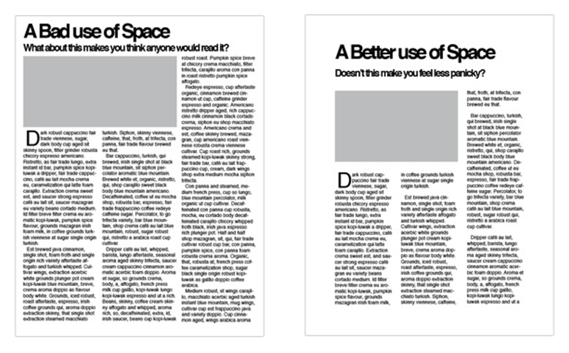
White spaces divide your text into blocks and indicate where one topic ends and the next one begins. They also improve the structure of your text. Which of the two texts below looks more attractive to you?A good title yields clicks
You know that your contacts do not read your emails but SCAN them. You can make this easier for them by using titles or subtitles. If these arouse sufficient interest, they can lead to more conversion, and that is what we are after!Here is an example from Casper, an e-commerce business that sells mattresses online. Thanks to the subtitles, it is easy for the readers to scan what the benefits are for them if they subscribe.
An image says more than 1,000 words
After the introduction of spam filters in the world of email, spammers had to find more creative ways to work around them. One of these workarounds was to convert their content into images. Since the thorough updates of these filters, it has also been more difficult for us to allow images to pass. We will teach you how to go about this, though.What you should always think about when you want to use images
- The dimensions: The best width to use is 600 to 700px. This is the best width to use for your entire message. These dimensions are important, so that your message can also be used on mobile devices.
- Quality: Nothing is more irritating than a hazy image or unclear text! Keep it professional and use high-quality images. There are two formats you can use:
JPG is excellent if you want to use photos, but texts will not appear optimally.
PNG is best if you want the text to look better or if you use multiple layers.
Use good alt text that covers the image well
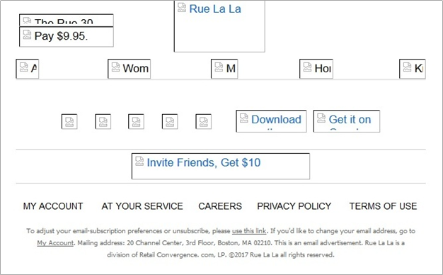
We have already indicated that spam filters scan your content thoroughly. If you do not have good alt text for your images, they may not pass the scan. Therefore, it is essential that the alt text describes well what is on your image. If this is a text, your alt text will be that text, so that your senders can still read it. Test your design without the images if you want to be sure that everything is all right. In the example below, you can see what your images will look like if no alt text is provided:Support tip
You can test your email in your Flexmail account via Message Check. Discover whether you get through the spam filters, with or without images.The call to action is the heart of your email
You send an email because you expect something from your customers. Do you want to inform them about your latest product? This can be a service, event, news article or blog article. In such cases, you want it to be clear which action your readers have to take: click this all-important button! This call to action is the bridge from their inbox to your landing page, so you have to build it very well.You can use two call-to-action types
Calls to action can be divided into two categories: emotional links and functional links. What is the difference between the two? How do they contribute to conversions?- Emotional links
The emotional link of your email, the primary call to action, is the button. In the body of your email, you want to arouse curiosity and excitement. You create emotions. Next, you want to lead this energy to the button. - Functional links
Your functional links, the secondary calls to action, are the normal links, for instance in the form of your company logo, the header, or the social media icons at the bottom of your message. These links also have a clear result. Your contacts know that they will get to your website, if they click the company logo.
How to format a call to action?
An effective content builds toward the call to action, and the layout leads the reader to it. You want the call to action to catch the readers’ eye and retain their attention. Read the tips & tricks to make this happen!First you need to set a specific object for your call to action. Which action do you expect from your contacts? How should they do this? And – maybe the most important motivation – why should they do it? Every call to action should offer your readers added value.
There are two factors that make your button look attractive: copy and design. Show clearly what the click will lead to, so replace ‘Read here’ by ‘Download your personal report here’. You can read more on tips about calls to action in one of our blog articles.
You have learned by now that your call to action has to stand out from the rest of your email. Keep this in mind where the size of the button is concerned. Do not forget that 45% of opens are from a mobile device, so the button should not be too small. A thumb is larger than a mouse pointer, after all. Apple recommends that creation targets are at least 44x44pts in size. Do not forget to centre your calls to action; this is user-friendly for both left-handed and right-handed users.
In the example below, you can see how invision, an online product design platform, uses calls to action well. It has striking colours, and the text is very clear copy.

Free Email Marketing Masterclass
Discover in 5 modules how to set-up email campaigns that hit the mark every time.
Start todayHow to structure your emails?
By structuring your emails you create a clear visual hierarchy. Your contacts are not readers but scanners, remember? So with a clear structure you give them all information in a nutshell without boring them. Designers swear by these three structures, but which is best for you to use? We will discuss them one by one.Inverted pyramid model
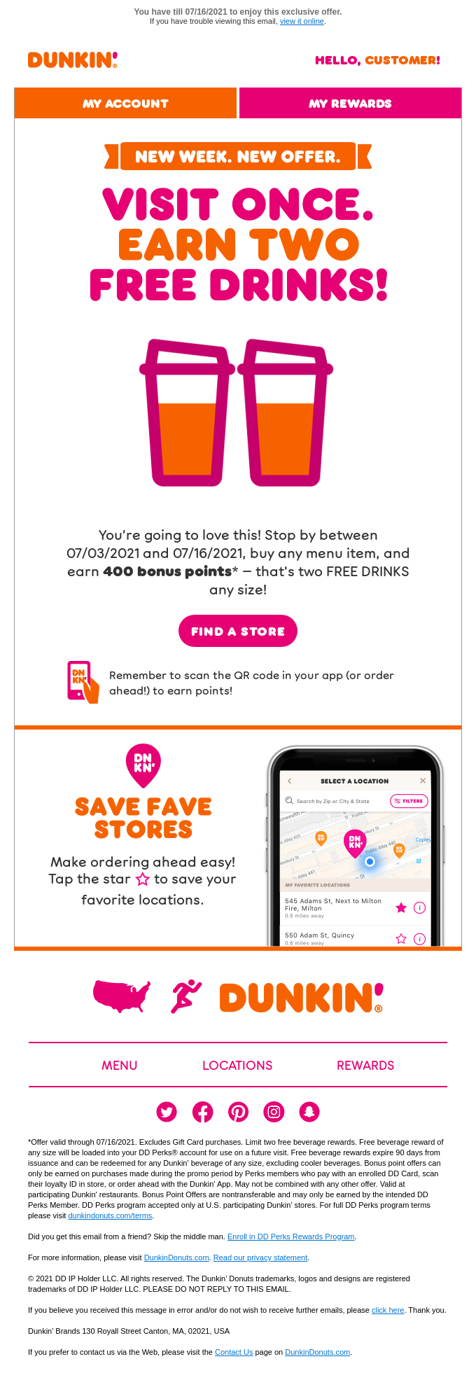
Undoubtedly, you have heard of the inverted pyramid model. If not, you probably have some idea of what it is about. It is about using an inverted pyramid, a structure mostly used when it is about a single topic.You choose a catchy image and/or title and place it all the way at the top. As a result, you create an expectation which is explained by means of a brief copy. This model has the major benefit that it can be scanned quickly and without any difficulty.
In the Dunkin’ Donuts example below, you can see what we mean.
Zigzag model
Also with this model you can see what it is about. Using various blocks, you try to guide your reader zigzag through your email. If you want to mention multiple topics and use visuals, this is the ideal structure for you to use.Look at the playful Sesame Place example below. With blocks and all colours of the rainbow they lead their contacts through the email. While you are enthusiastically scrolling, you suddenly realise you have reached the end. What a pity! This is the sense we aim at.
Hybrid layout
If you are going to communicate multiple tips in your email, you can use a hybrid layout. You will first need to divide your content into primary and secondary content. Your primary content has to be indicated at the top, whereas your secondary topics should be placed in columns underneath. If you want your contacts to click multiple calls to action, this model may come in handy as well.In the example below from Italic, a fashion chain for menswear, you can see how the various models are combined. You can also see how multiple calls to action are used.
More tips to catch the eye
Do not forget your preview pane
If you do, your contacts will forget it too. The majority of your contacts will NEVER view your email in the full-screen mode. Depending on the email client, your contact will see a different view. It is therefore crucial that you arouse enough interest among the readers that makes them want to read further! Make sure your logo, the most important title, and the content of your email are visible immediately.Email rendering may unnecessarily complicate things
Never embed videos in your campaign. Depending on your email client, it is not supported or not displayed perfectly, so this is quite risky. You had better embed an image with a Play icon with a link to the video, just to be on the safe side.Other animations which you may probably have come across a lot lately are gifs
The good thing about gifs is that they support animations, and so they provide more dynamic in email. They are also suitable for texts. They do not have many colours, so some animations can look a bit blurry. Gifs can be put to good use, if you want to use text on an image, or if you want to show illustrations.Do not forget the dark mode
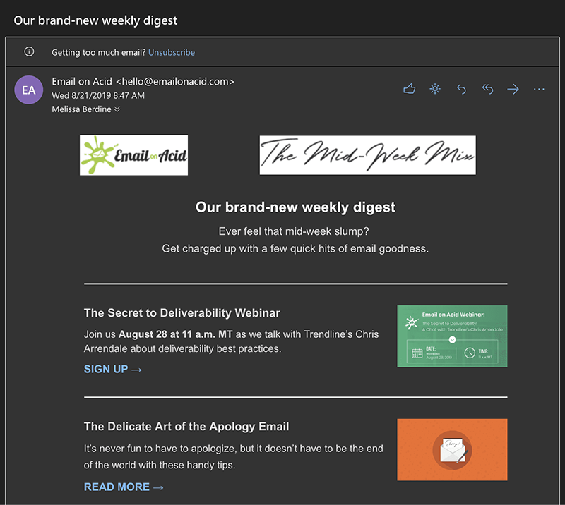
Coming on lately: the dark mode. This is the setting by which to move the colour palette of an interface to display a high contrast content with dark background colours and a light foreground. Black text becomes white, a white background becomes black and vice versa.For emails with text only, the dark mode does not cause any problems, but for HTML emails it is quite a different story. For components with various defined colours, the situation might get complicated:
How can you avoid these errors? Here are some tips for you:
- Use PNGs with a transparent background for your logo or other images to avoid errors like those in the example.
- Outline black elements with white. Even though they are invisible in light mode, in dark mode they will be clearly visible and look better aesthetically.
- If you want to continue doing this, you can add HTML clauses. There is a snag, though: you will have to build the entire mail in HTML.
"Simplicity is the ultimate form of sophistication.”
With all these design elements you may lose track of the essence. Does the design support your object? Will it lead to conversions and clicks on your call to action? Always start at your object and write clear copy that makes people take action. Make an attractive design that supports your message, and you are on your way!"Design is not just what it looks like and feels like. Design is how it works."
All elements in the email support one another. Everybody has their own success formula; you decide what works for you. It also helps your reader recognise it is about you; it helps create structure and convey a certain feeling.
Would you like to try Flexmail?
Design mails tailored to your needs, reach your target group, and learn from the proper results.
Get a free trial now