‘Why don’t you just call this a button?’ Because a call to action says so much more about what you really want to do with this button. You want people to click through to what you are trying to sell them. This might be a product, a course or a blog.
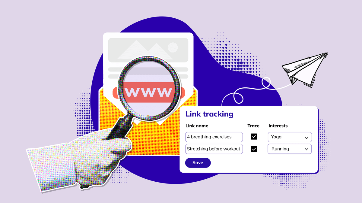
People who click tell you something about themselves: what they find interesting. You can use this information to write better content for your next emails.
Obviously, there are sector-specific words that can touch the right chord with your readers, but the tips below are just as important:
People who click tell you something about themselves: what they find interesting. You can use this information to write better content for your next emails.
Obviously, there are sector-specific words that can touch the right chord with your readers, but the tips below are just as important:
Choose your goal
Obviously, your goal is to get people to click. But ask yourself these three questions:- What do I want my readers to do?
- How will they know what to do?
- And why would they do it?
So, what will they know or be able to do later? Will they be better at their job because of your offer? Will they solve a problem? Lose weight? Save money?
Such reasons must at least be in the text above your call to action. They should have an obvious ending, like: ‘Book your free consultation today.’
1. Stop using ‘read more’ or ‘click here’
There are two major elements, also in this article: the language you use and your design.Your design must ensure that your call to action catches the reader’s attention. The language encourages people to do something with your button.
All too often, we come across text links or buttons with the text ‘read more’. This is a classic example of weak, passive language for a call to action.
‘Read more’ may seem fine because you tell the readers exactly what to do. But it doesn't give them any incentive to click. So, what does that mean? Firstly, you want your button to be clear. Your target group then knows immediately what they can expect after clicking the button. Uninterested readers will not be deceived.
‘Click here’ has also become trite. In the early days of the Internet, not everybody knew what a link was. Times are different now. Today, using a ‘click here’ link is old-fashioned and even spammy.
If you want to create a link in a piece of text, it is modern to turn the whole sentence into a link. It could look like this: Does a call to action no longer hold any secrets to you? In this blog, we discuss all the elements of a perfect email in further detail.
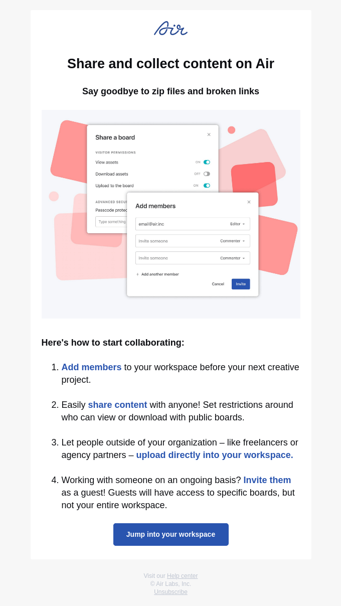
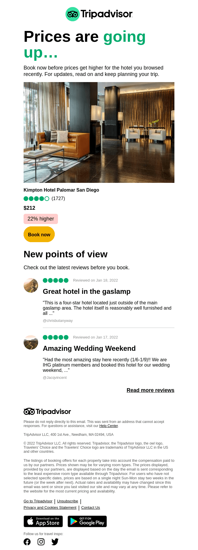
In the example above, a difference is made between ‘reading’ and ‘listening’. These buttons could be a lot catchier, though.
2. Tell the reader what is next
But if you can't use ‘click here’, what can you use? Try to explain what is going to happen on the next page. Or why they really need to click.Think of buttons like:
- Set your preferences
- Discover the new collection
- Start planning/testing
- Show me how
3. Start with an effective call-to-action verb
You want your call-to-action texts to be short and convincing. Get to the point immediately: What must your reader do? Start with your action.Do you want your reader to buy something? Use: ‘buy’, ‘shop’, ‘order’.
Are you promoting a white paper? Start with: ‘download’ or ‘register’.
Do you want your reader to fill something in? Try: ‘Register’ or ‘Contact me’.
Let’s have a closer look at the white paper example. If you say: ‘Our latest white paper is available,’ this information is correct. However, you don't say when they can expect it or what they should do. ‘Download our white paper today’ or ‘Start your 10 tips today’ is therefore better.

Free Email Marketing Masterclass
Discover in 5 modules how to set-up email campaigns that hit the mark every time.
Start today4. Stir your reader’s emotion or enthusiasm
If you are looking for a reaction, you must start strong. Look at the following example: ‘Order now and receive a 50% discount!’ You provide a huge discount, and you include an element of urgency, because no one wants to miss out on this amazing deal!If you sell family trips, you want to arouse a specific feeling: ‘Plan your dream holiday today.’ There's a good chance your reader will want to discover what makes your offer so special.
You are looking for the words or the feeling that will ensure that your reader must act.
Use FOMO
FOMO (fear of missing out) makes it impossible for people to think rationally, and take a decision based on emotion. Nobody wants to miss out on a good deal, especially if it's a product or service they've been considering for a while.5. Be creative
Just like your ordinary text, your call to action must stand out. Not sure? Use AB testing to see which variant works best for your target group. You can alternate your successful calls to action with an original idea, for example. You only know if something works if you try.For example, test:
‘Get started’ versus ‘Your healthier lifestyle starts today.’
Additionally, you want to write in the style in which your target group speaks. The text should therefore be easy and convincing to read. Puns make your text less dull.
6. Use numbers where you can
People tend to respond well to numbers. You can use these in prices, discounts, promotions, etc. It helps us determine whether something is worth spending our money on, and it makes things specific.Useful price information in your email is ideal, and the same applies to your call to action. If your readers have already been informed about the price and decide to click through, you know that they are much less likely to leave your website because of the price. You have collected information via the click and obtained a higher conversion chance.
‘Buy your favourite piece of furniture for less than €300’ emphasises the deal and responds to FOMO. You can also use other interesting statistics.
7. Your CTA is not an island
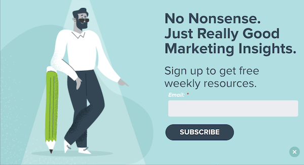
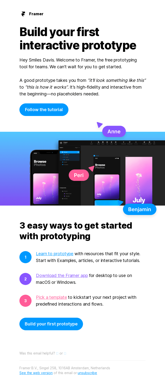
We mentioned it before: always look at the whole context. Your readers decide whether they will click through or not based on multiple elements: your text, your introduction, and the button. If your title and introduction have enough context, your call to action should give your reader the final push. So, make sure that all elements work well together to have the desired effect. With all elements, you are working towards a ‘Yes’.Take this example: What could be more no-nonsense than a ‘Register’ button? The copy is specific too, because you know exactly what you will get: weekly emails with free tips. All the elements work together and strengthen each other.
Formulate benefits/reviews/USPs near the button
You have aroused the readers’ interest, and they are about to click through. Now is the moment to use your persuasiveness. State your USPs, mention quality labels, or add a strong testimonial.8. Make them visible
You'd be surprised if you knew how many marketers hide their call to actions below the fold. Others place it a bit higher on the page, but don't really manage to make it catch the eye.This is important: if it isn't clear to an interested reader how to easily get to the next step, they will probably leave. Result: you lose clicks and sales. So be clear and make sure that your reader’s scanning eye or scrolling mouse naturally ends up with a clearly visible call to action.
9. Use ‘I’ instead of ‘you’
We know from research that calls to action like ‘Start my free trial period’ do better than ‘Start your free trial period.’ Can you use the first person singular? If so, choose that. The same applies to your texts. People want to recognise themselves in your story.10. Large buttons, short text
Your buttons should be immediately understandable. This means that the button should be large visually, with sufficient white space around and on the button. People also expect that buttons are not spread across the full width of your mail and don't have much text.11. Small step versus big leap
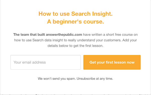
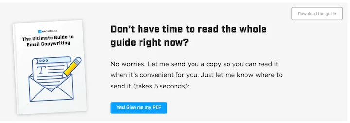
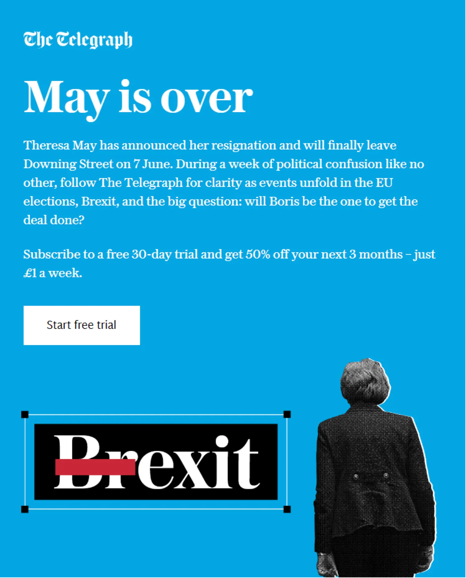
People don't like friction. You therefore need to find out how to make readers less reluctant to click. In the example below, the title and introduction lead to the call to action. ‘This will only take 5 seconds’ tells your reader that it is only a small task, and the brackets make it sound more casual.This example from The Telegraph is also interesting:
Instead of persuading you to take out a paid subscription, they try to get as many interested people as possible for a ‘free trial period’. This would be even more effective if you can add that you can unsubscribe at any time and that no payment information is required to start the trial period.
Once you ask people to spend time or money, you are asking them for strong commitment. This can discourage your reader, particularly with a ‘casual’ medium like email. Think about ways to make this step smaller by asking your target group for a smaller investment.
Do you wonder about various versions of your call to action? Great. That means that you have spent enough time on your buttons. Using AB testing is better than trusting your gut feeling. Now you know exactly what works with your target group!

Would you like to try Flexmail?
Design mails tailored to your needs, reach your target group, and learn from the proper results.
Get a free trial now Michelle Dassen